BRITE Labs
BRITE Labs
Visual identity for BRITE Labs, a California-based medical collective developing the purest quality cannabis extracts
while prioritizing safety to ensure dependable medications for its patients. The brand needed a re-design and re-definition
of its tone of voice in order to stand out among its growing number of competitors.
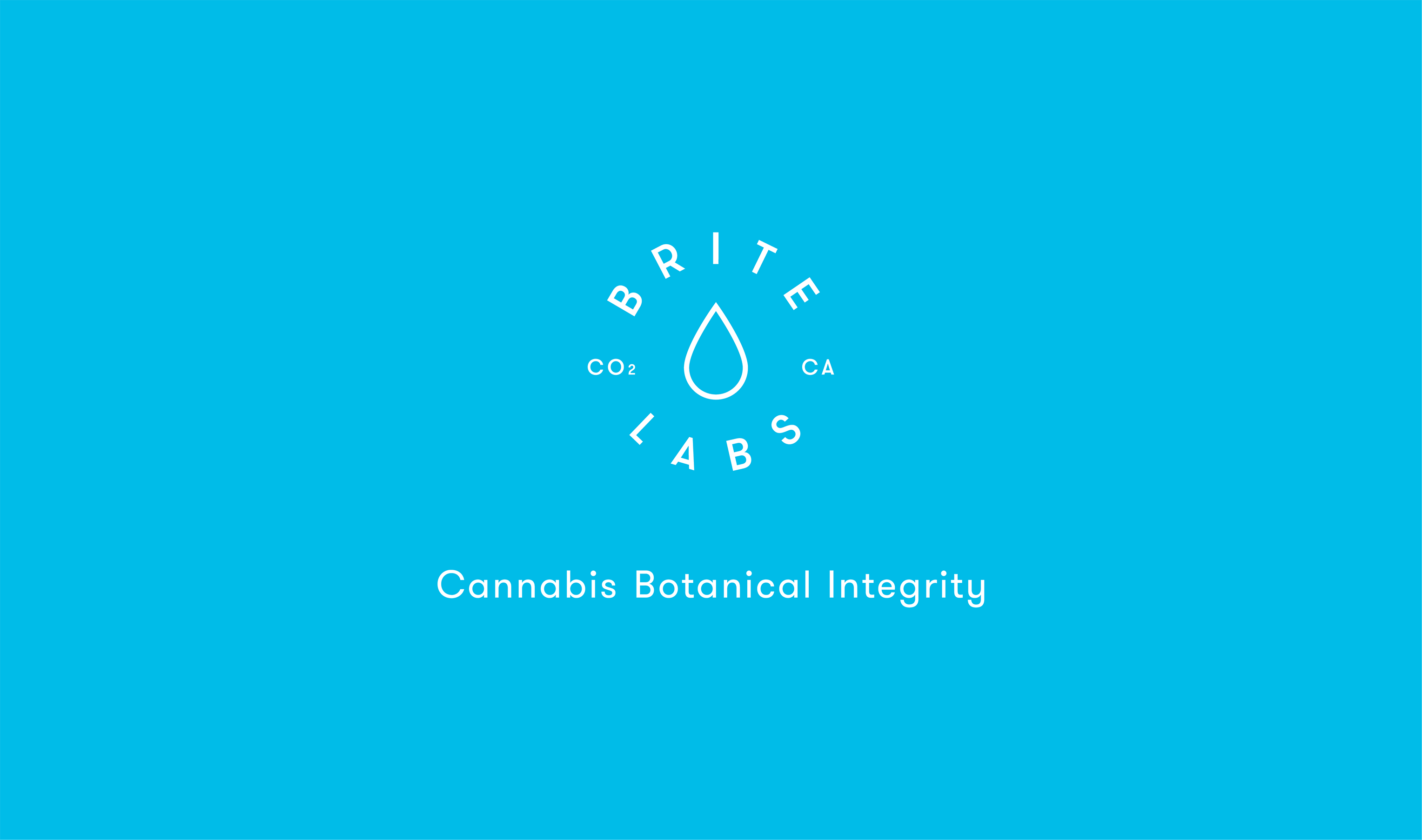
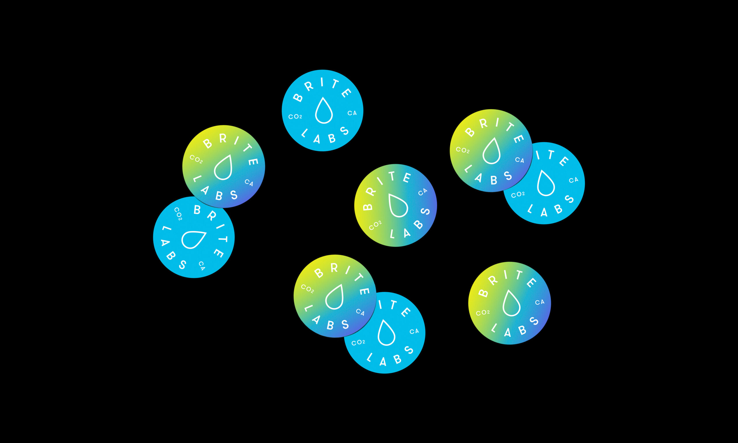
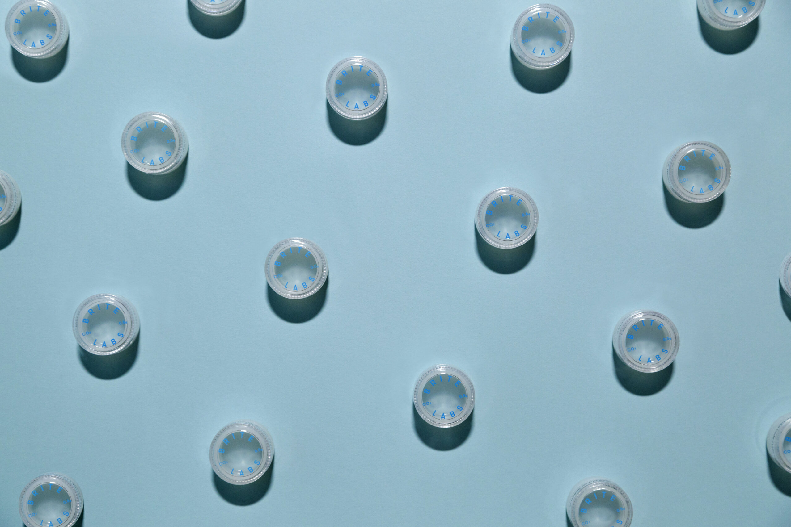
Referencing BRITE Lab’s product offering based on each cannabis strain (indica, sativa, hybrid and CBD), I developed
a visual system based on gradients, encompassing its flavor variety. This concept is expressed visually through a
chromatic gradient, applied across the entire new identity and harmoniously integrated
with the logo, secondary mark, and typographic system.
Visual identity for BRITE Labs, a California-based medical collective developing the purest quality cannabis extracts
while prioritizing safety to ensure dependable medications for its patients. The brand needed a re-design and re-definition
of its tone of voice in order to stand out among its growing number of competitors.
Referencing BRITE Lab’s product offering based on each cannabis strain (indica, sativa, hybrid and CBD), I developed
a visual system based on gradients, encompassing its flavor variety. This concept is expressed visually through a
chromatic gradient, applied across the entire new identity and harmoniously integrated
with the logo, secondary mark, and typographic system.
Visual identity for BRITE Labs, a California-based medical collective developing
the purest quality cannabis extracts while prioritizing safety to ensure dependable medications
for its patients. The brand needed a re-design and re-definition of its tone of voice in order
to stand out among its growing number of competitors.
Referencing BRITE Lab’s product offering based on each cannabis strain
(indica, sativa, hybrid and CBD), I developed a visual system based on gradients,
encompassing its flavor variety. This concept is expressed visually through a
chromatic gradient, applied across the entire new identity and harmoniously integrated
with the logo, secondary mark, and typographic system.
Visual identity for BRITE Labs, a California-based medical
collective developing the purest quality cannabis extracts
while prioritizing safety to ensure dependable medications for its patients. The brand needed a re-design and re-definition
of its tone of voice in order to stand out among its growing
number of competitors.
Referencing BRITE Lab’s product offering based on each cannabis strain (indica, sativa, hybrid and CBD), I developed
a visual system based on gradients, encompassing its flavor variety. This concept is expressed visually through a chromatic gradient, applied across the entire new identity and harmoniously integrated with the logo, secondary mark,
and typographic system.
Visual identity for BRITE Labs,
a California-based medical collective developing the purest quality cannabis extracts while prioritizing safety to ensure dependable medications for its patients. The brand needed a re-design and re-definition
of its tone of voice in order to stand out among its growing number of competitors.
Referencing BRITE Lab’s product offering based on each cannabis strain
(indica, sativa, hybrid and CBD),
I developeda visual system based on gradients, encompassing its flavor variety. This concept is expressed visually through a
chromatic gradient, applied across the
entire new identity and harmoniously integrated with the logo, secondary mark,
and typographic system.
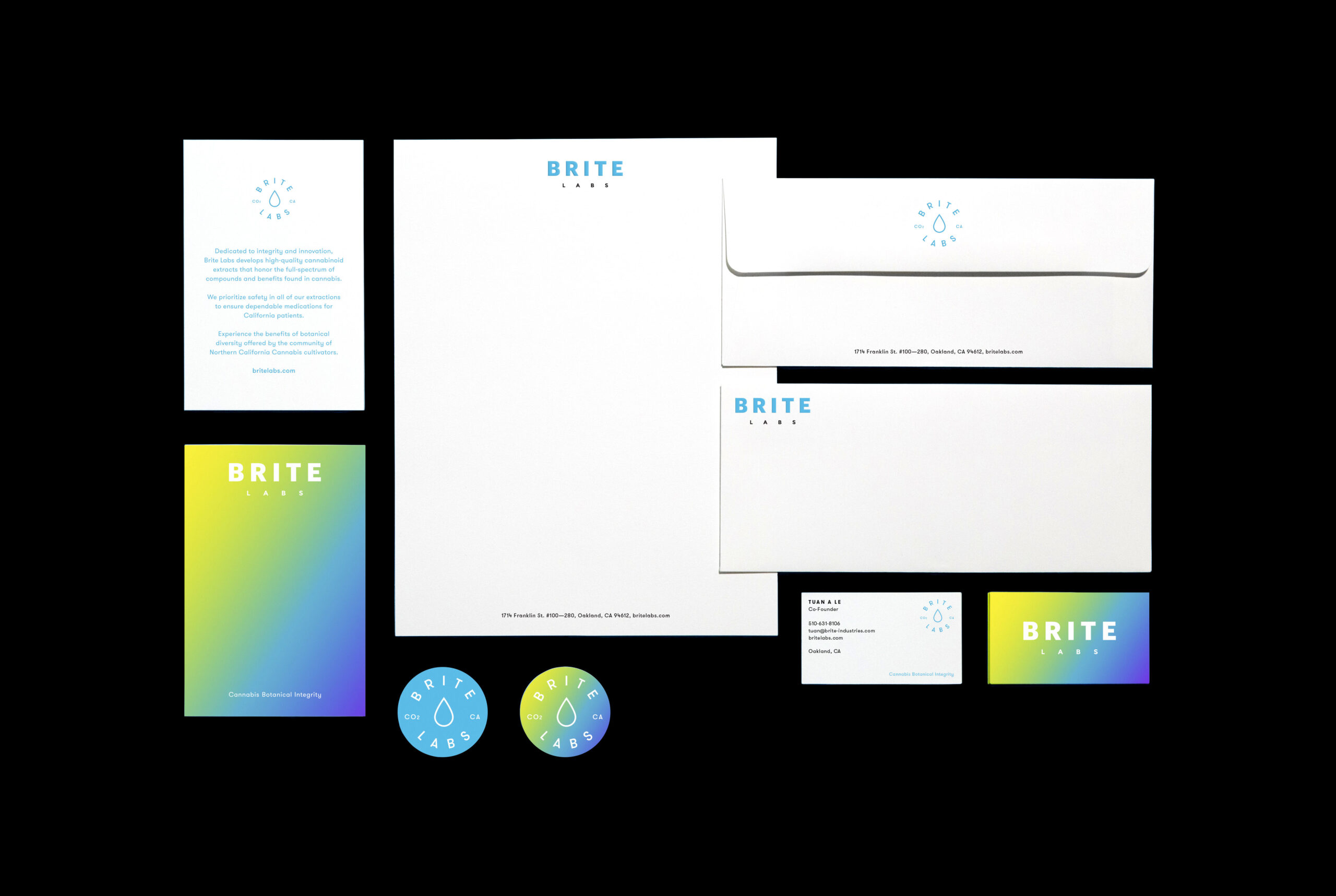
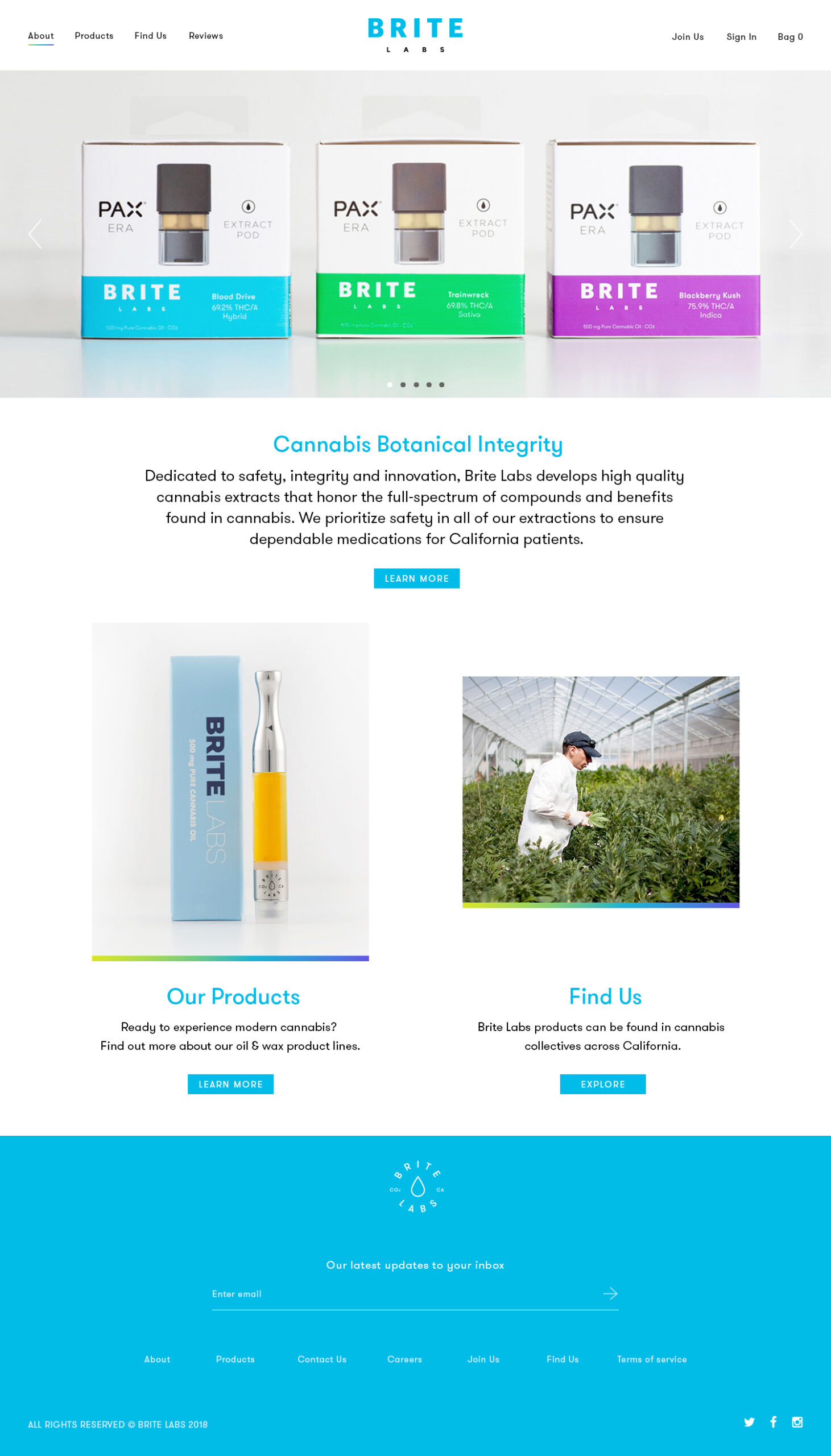
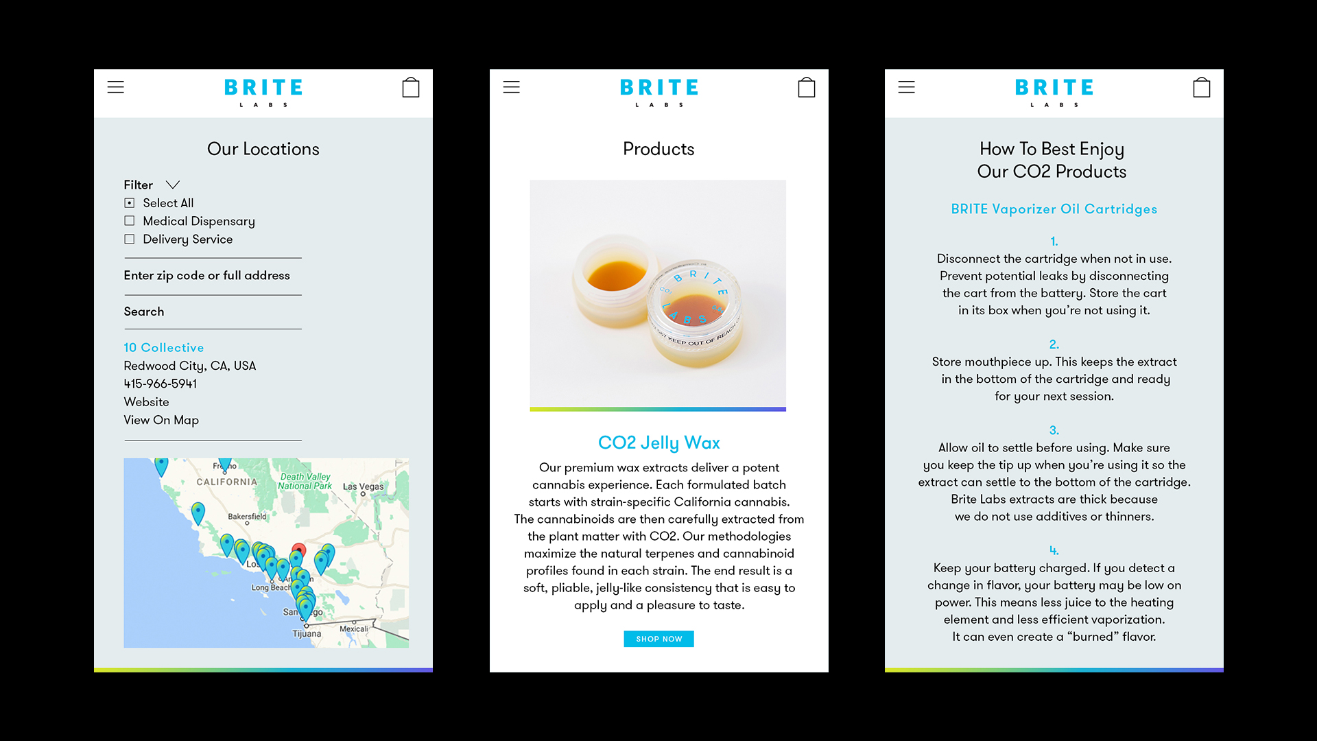
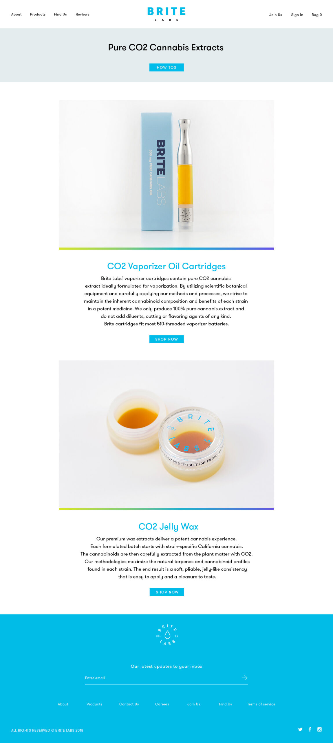
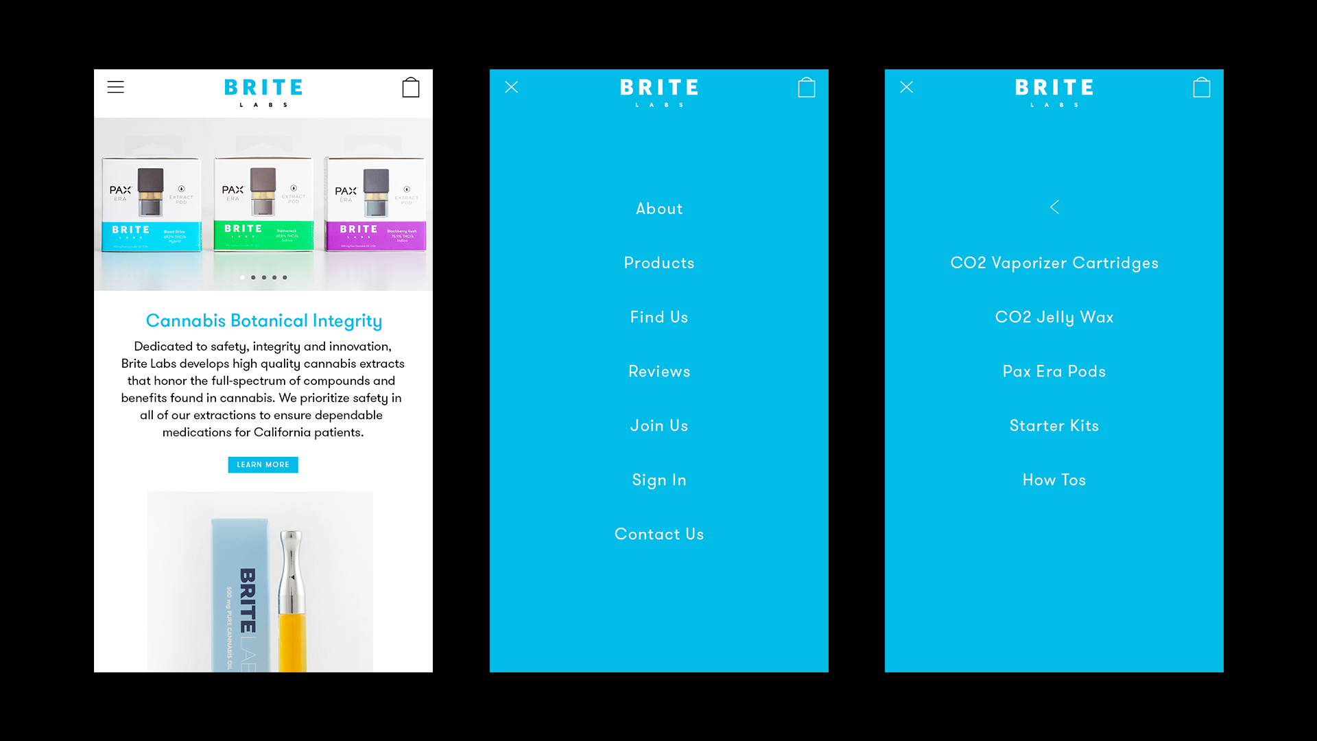
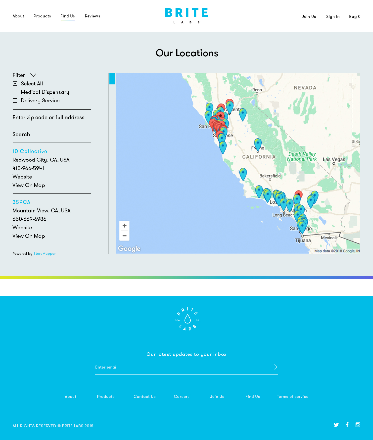
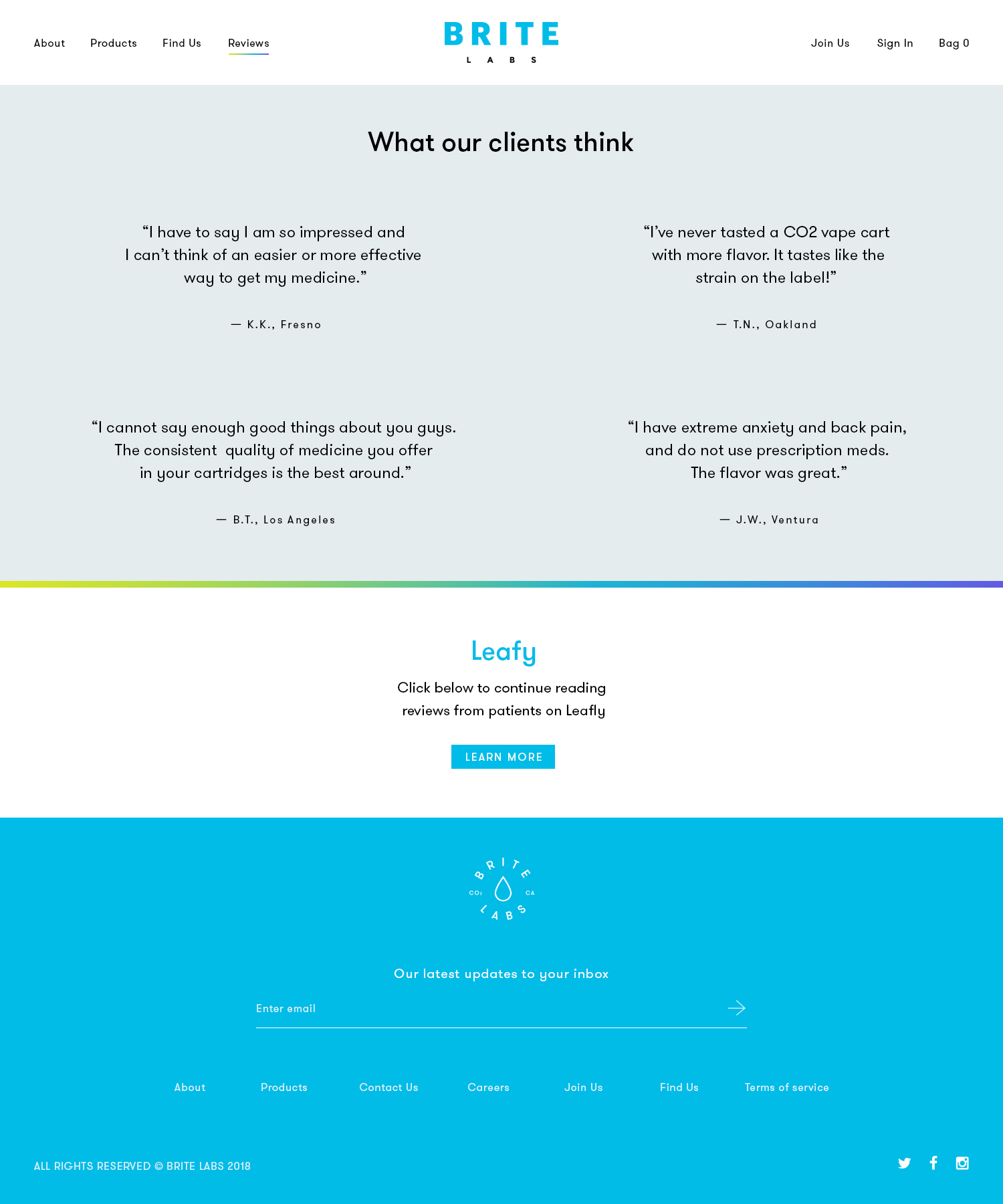
I wanted to create a visual identity that stands out from the crafty, west-coast look that cannabis products are normally
associated with. The aim was to position BRITE Labs as a vibrant, modern, medical company with a lifestyle feel.
The result is a visual expression of the brand that perfectly matches its name: BRITE Labs.
From concept to print production, I led and followed the entire design process, which included several print,
packaging and digital touchpoints, along with website design.
I wanted to create a visual identity that
stands out from the crafty, west-coast look that cannabis products are normally
associated with. The aim was to position BRITE Labs as a vibrant, modern, medical company with a lifestyle feel.
The result is a visual expression of the brand that perfectly matches its name: BRITE Labs.
From concept to print production, I led and followed the entire design process, which included several print, packaging, and digital touchpoints, along with website design.
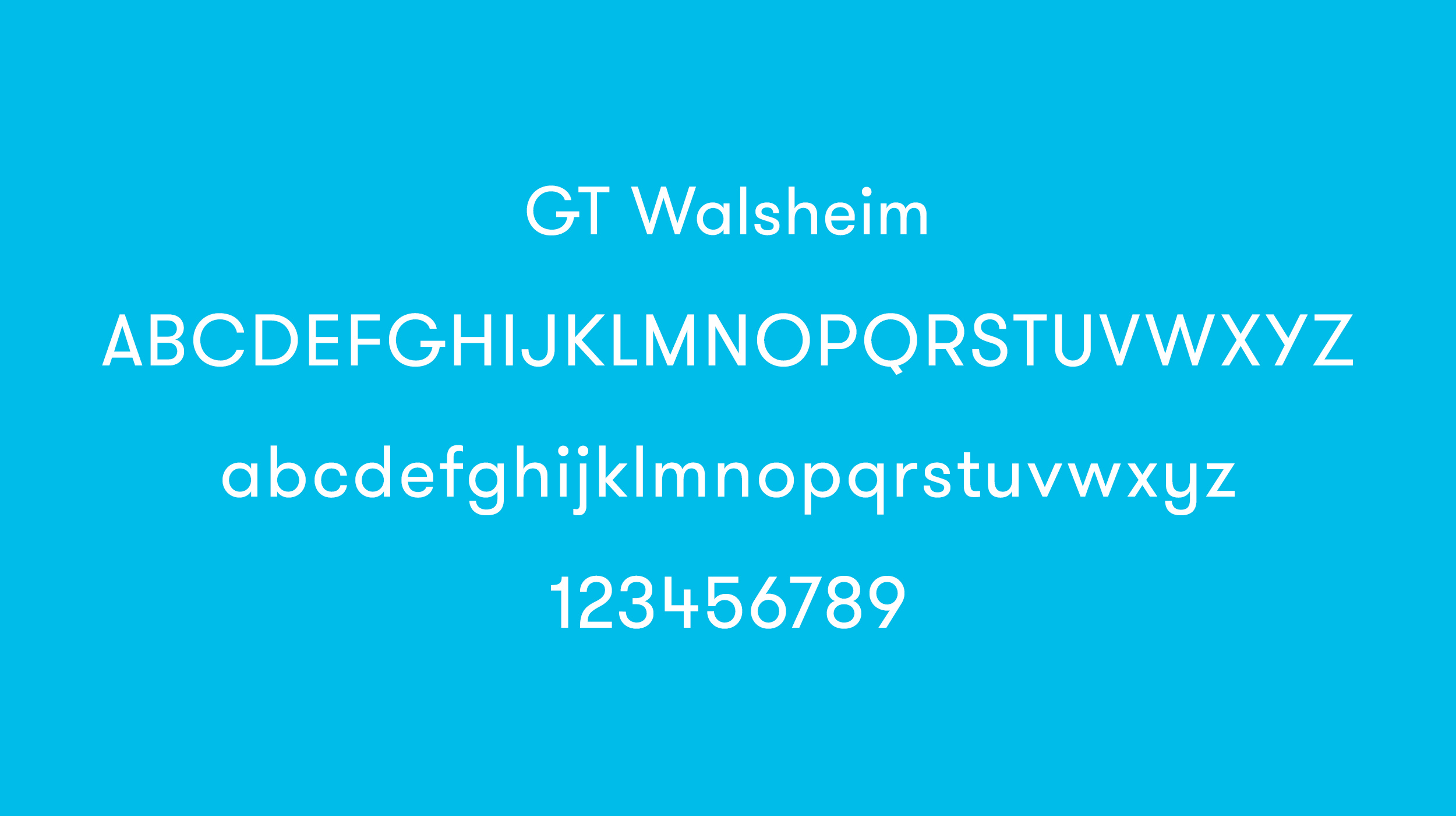
BRAND TYPEFACE
Inspired by the lettering of Swiss poster designer legend Otto Baumberger from the 1930s, GT Walsheim is a friendly but precise typeface.
This helps convey Brite’s clean, modern character while appealing as trustworthy.
BRAND TYPEFACE
Inspired by the lettering of Swiss poster designer legend Otto Baumberger from the 1930s, GT Walsheim is a friendly but precise typeface. This helps convey Brite’s clean, modern character while appealing as trustworthy.
BRAND TYPEFACE
Inspired by the lettering of Swiss poster designer legend Otto Baumberger from the 1930s, GT Walsheim is a friendly but precise typeface. This helps convey Brite’s clean, modern character while appealing as trustworthy.
ROLE: Branding and Design Direction
CLIENT: BRITE Labs
STYLING PHOTOGRAPHY: Rudolf Costin
Paid Social CreativeBranding & Digital Ad Design
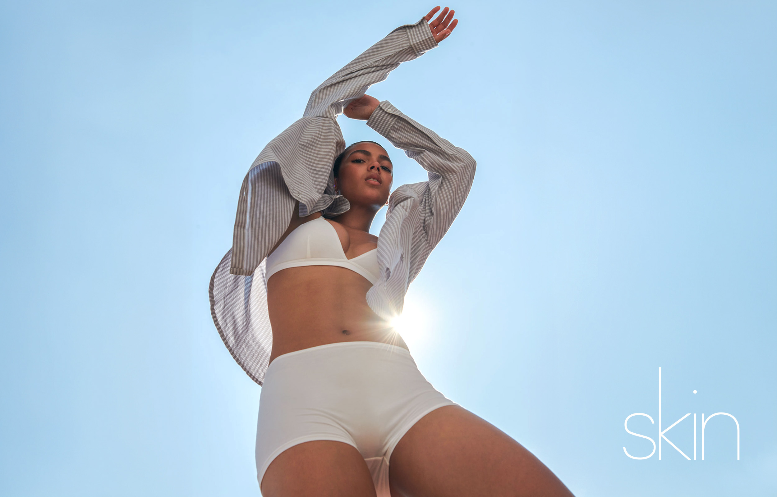
SkinBranding & Digital Design
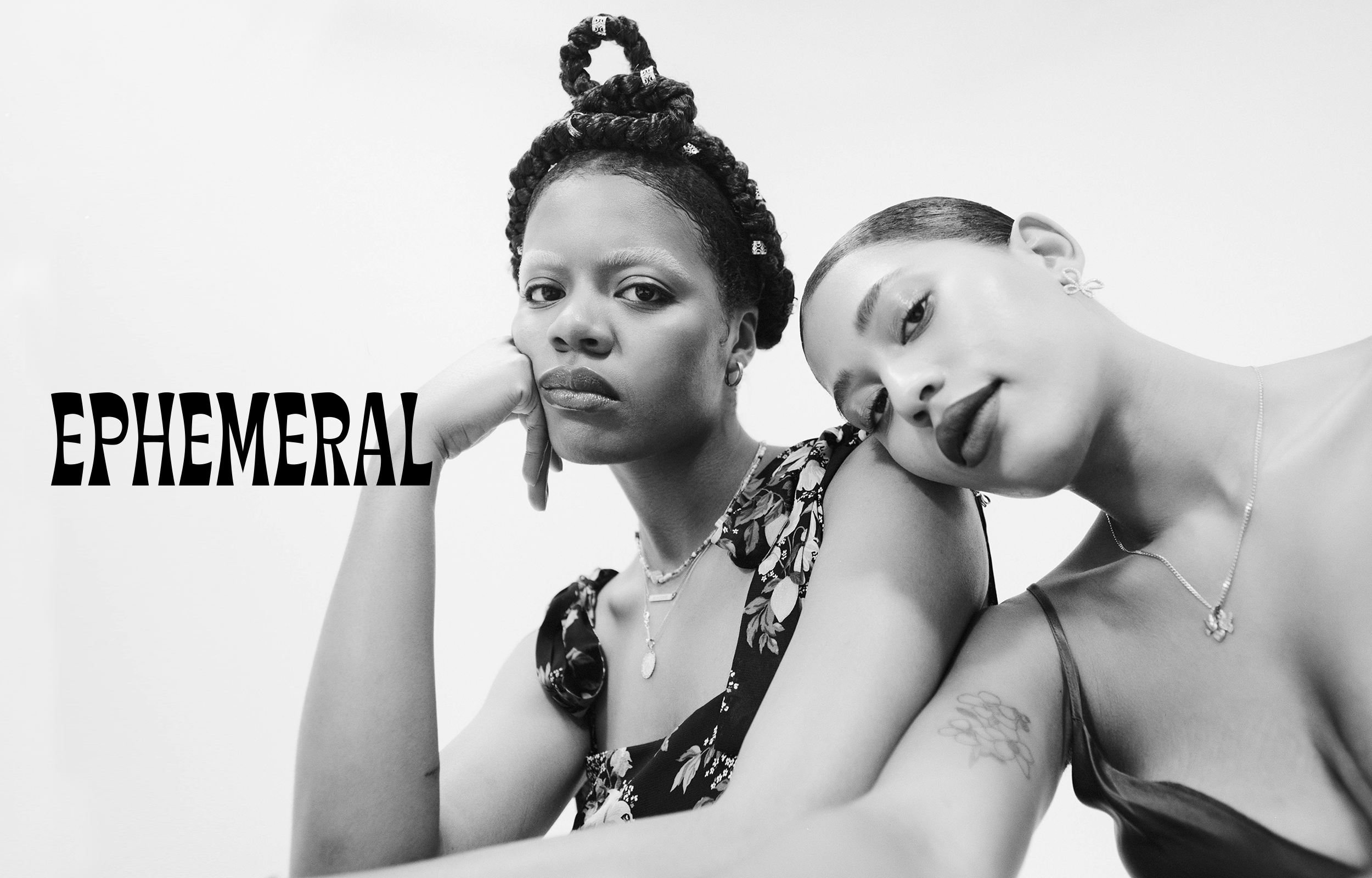
EphemeralBranding & Digital Design
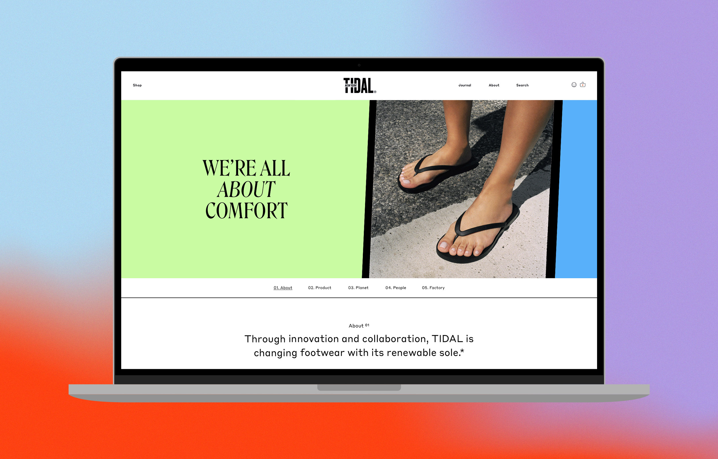
TIDAL About Us-DigitalBranding & Web Design
TIDAL Emails & SocialBranding & Digital Design
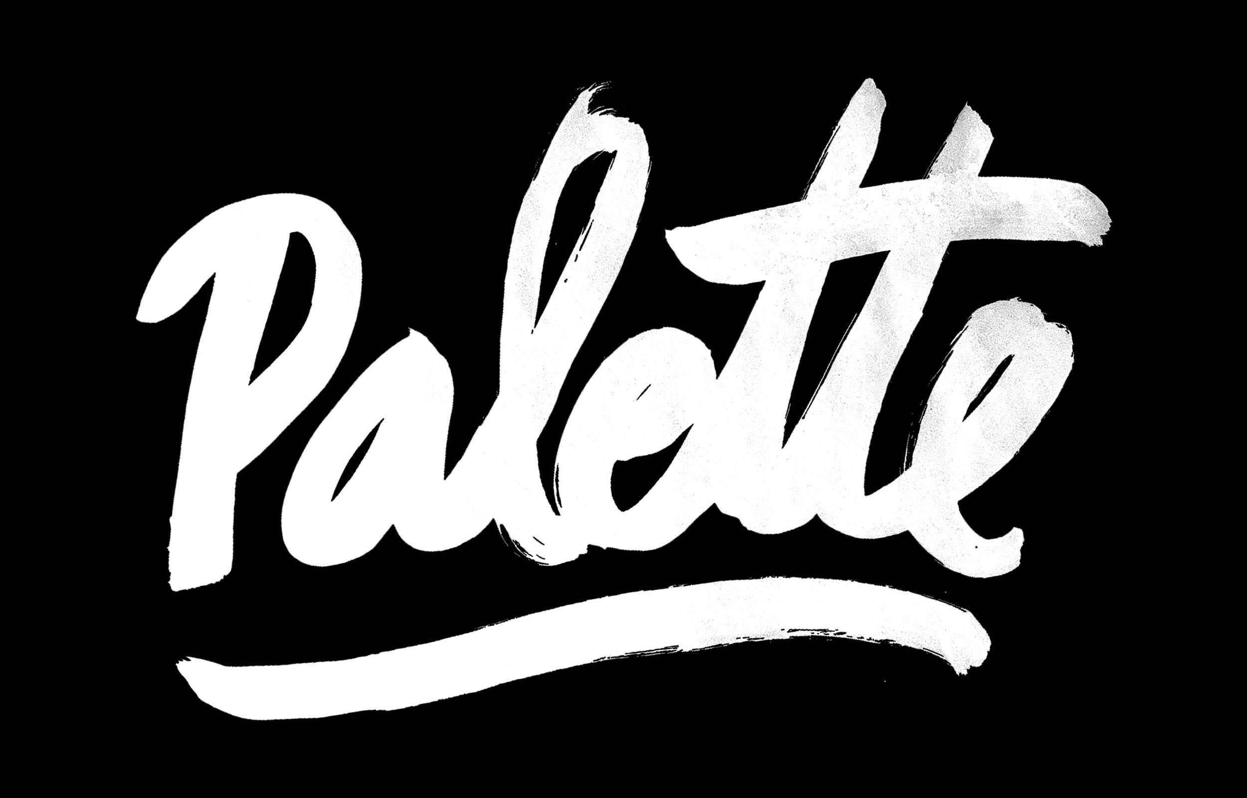
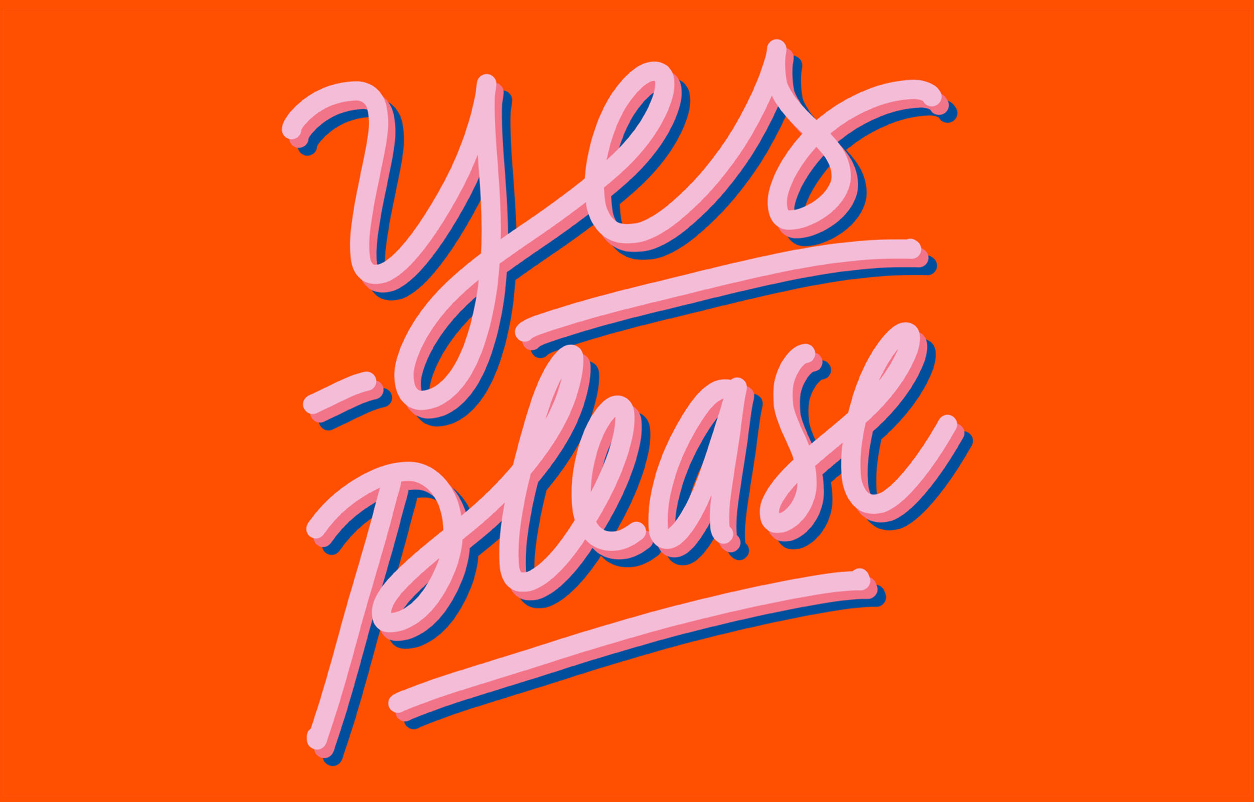
Palette LetteringIllustration
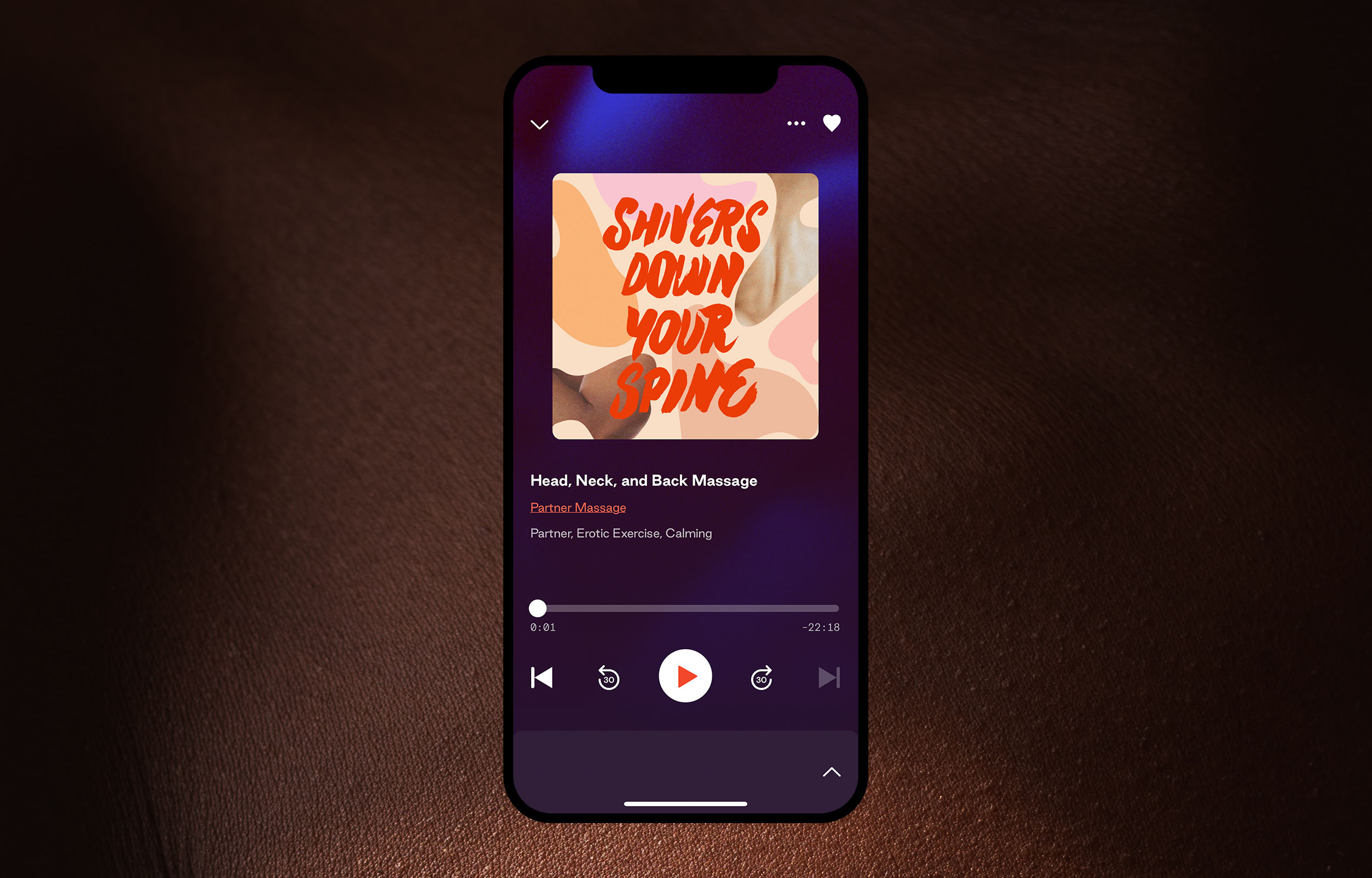
DipseaIllustration
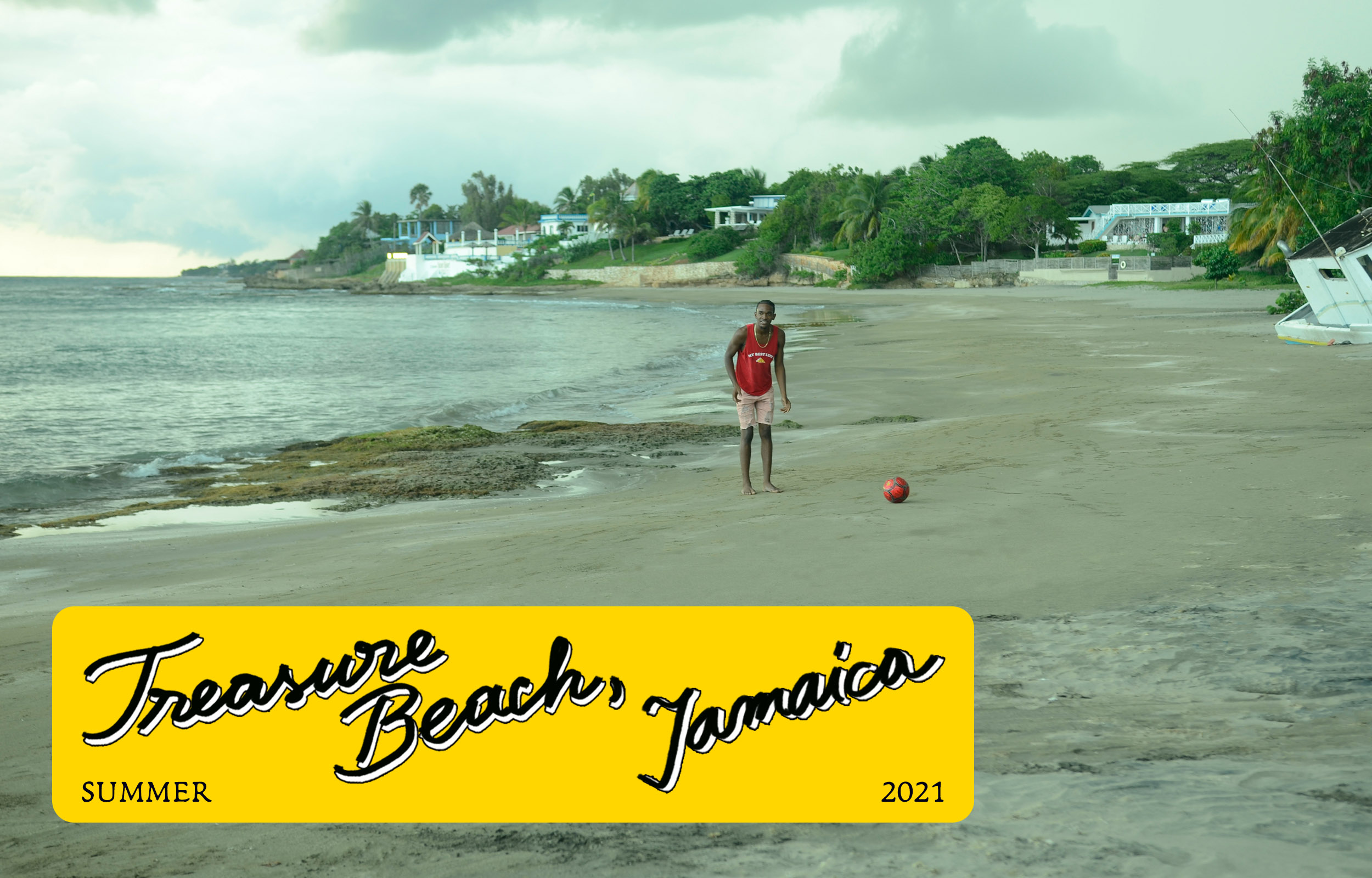
TIDAL Jamaica EditorialDigital Design
TIDAL Discovery PageWeb Design
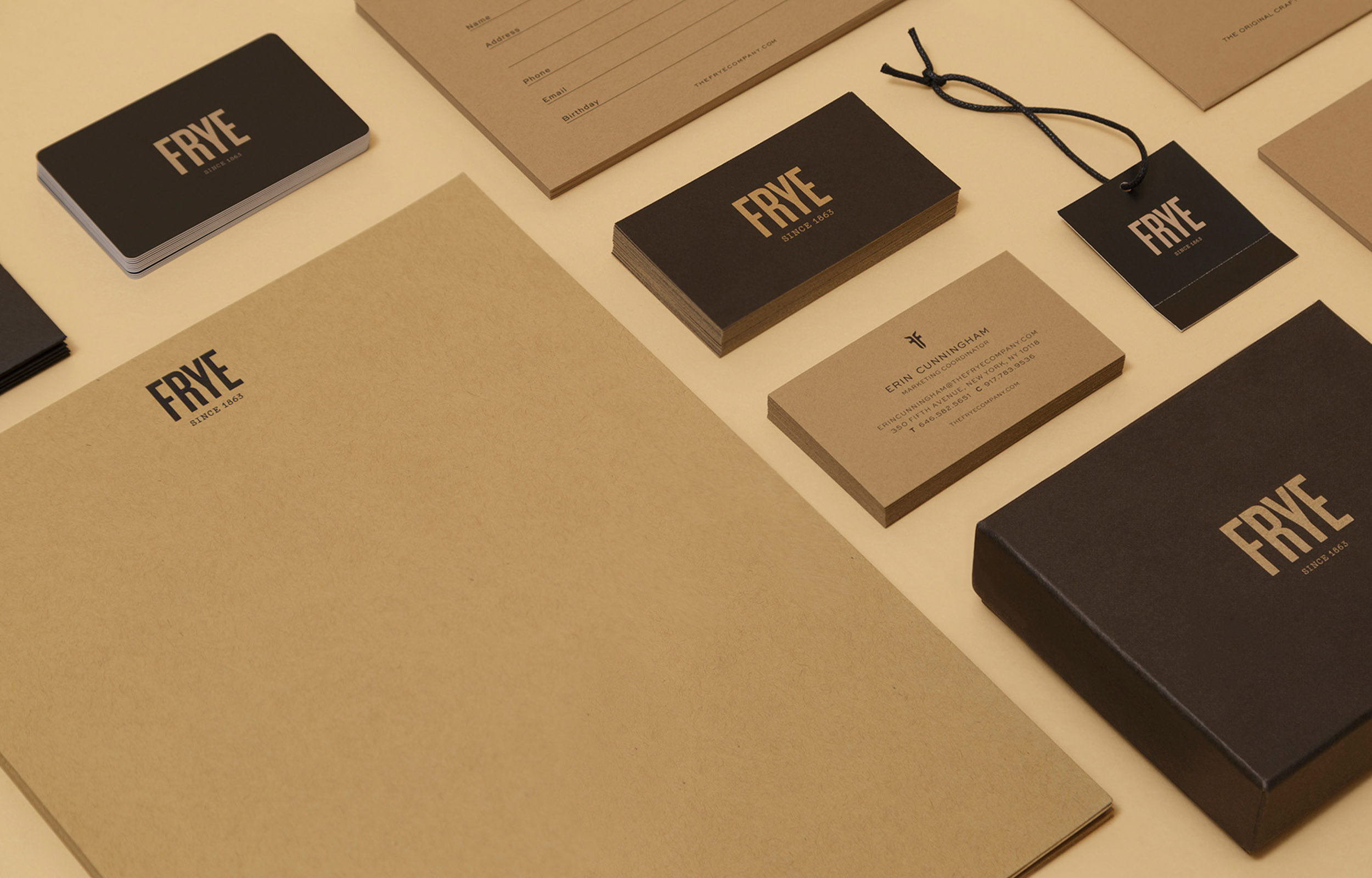
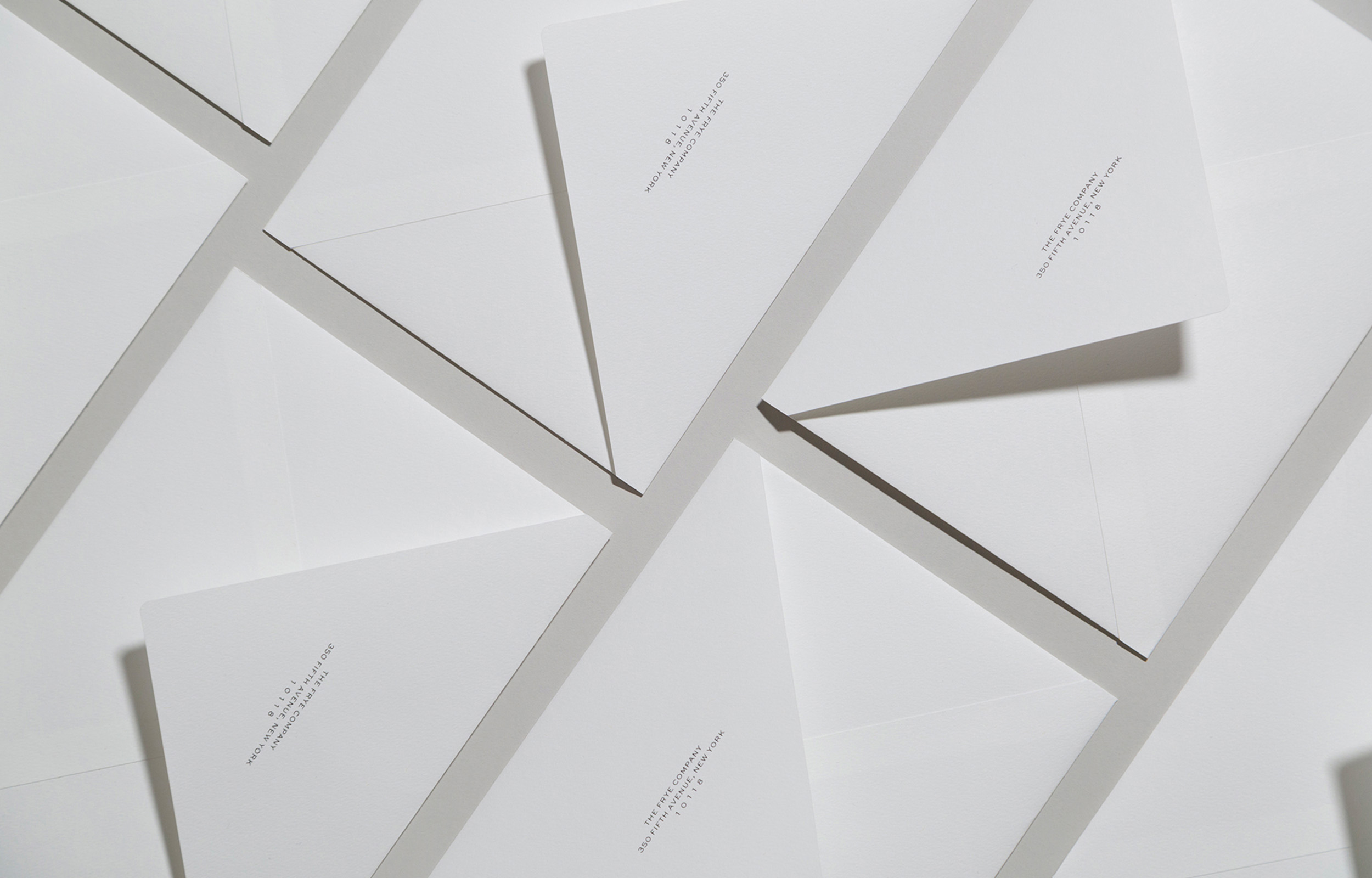
Frye BrandingGraphic Design
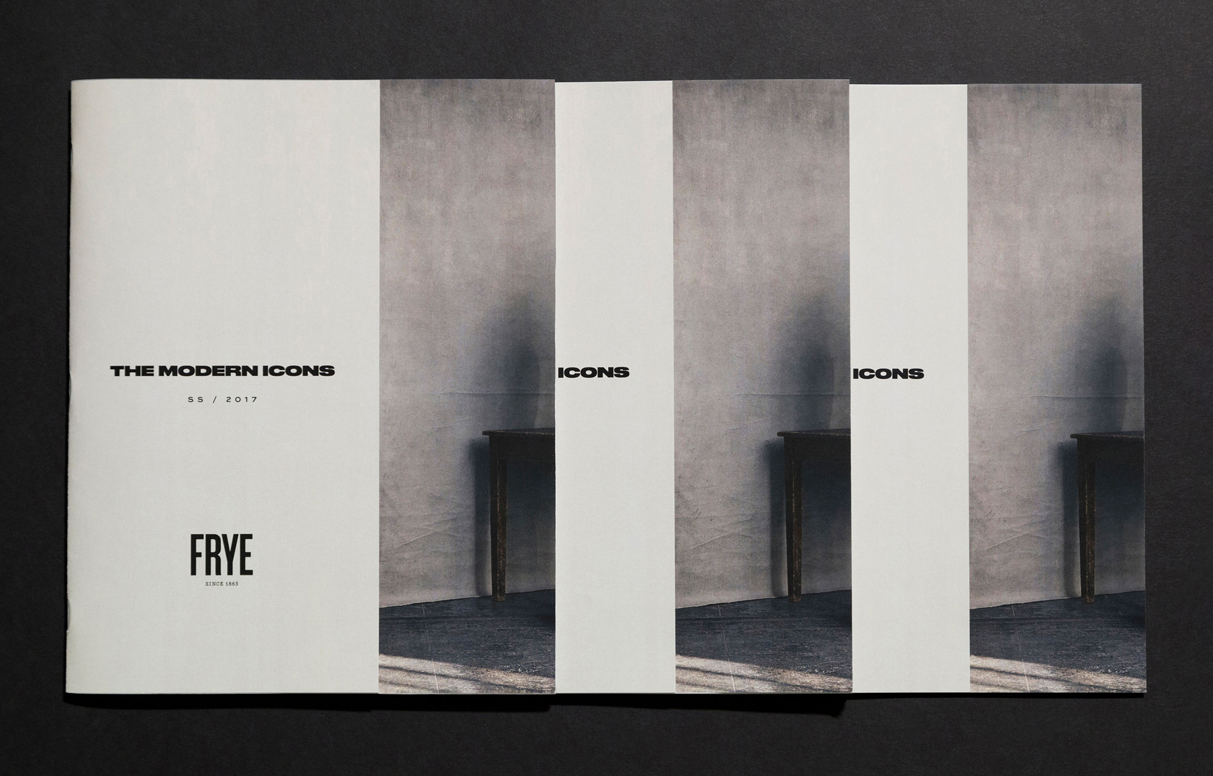
Frye SS/17 LookbookDesign
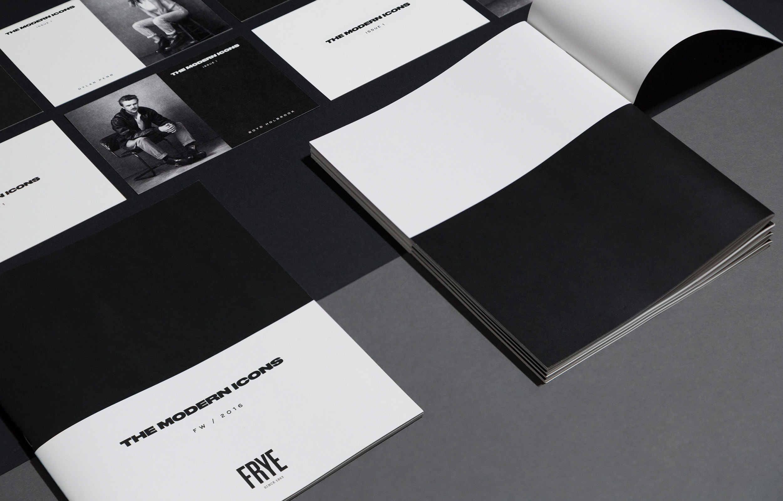
Frye FW/16 LookbookDesign
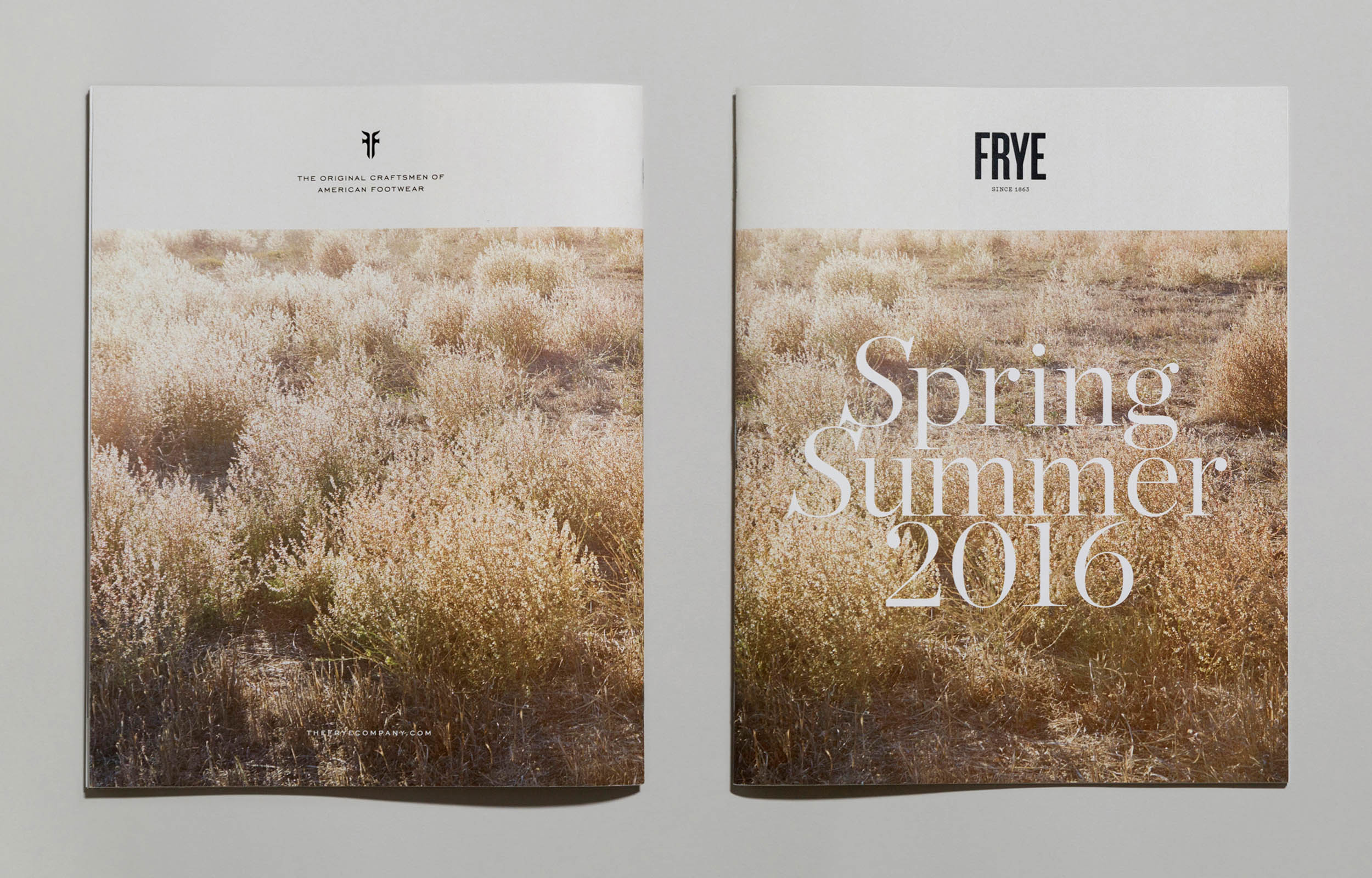
Frye SS/16 LookbookDesign
Frye Events CollateralDesign
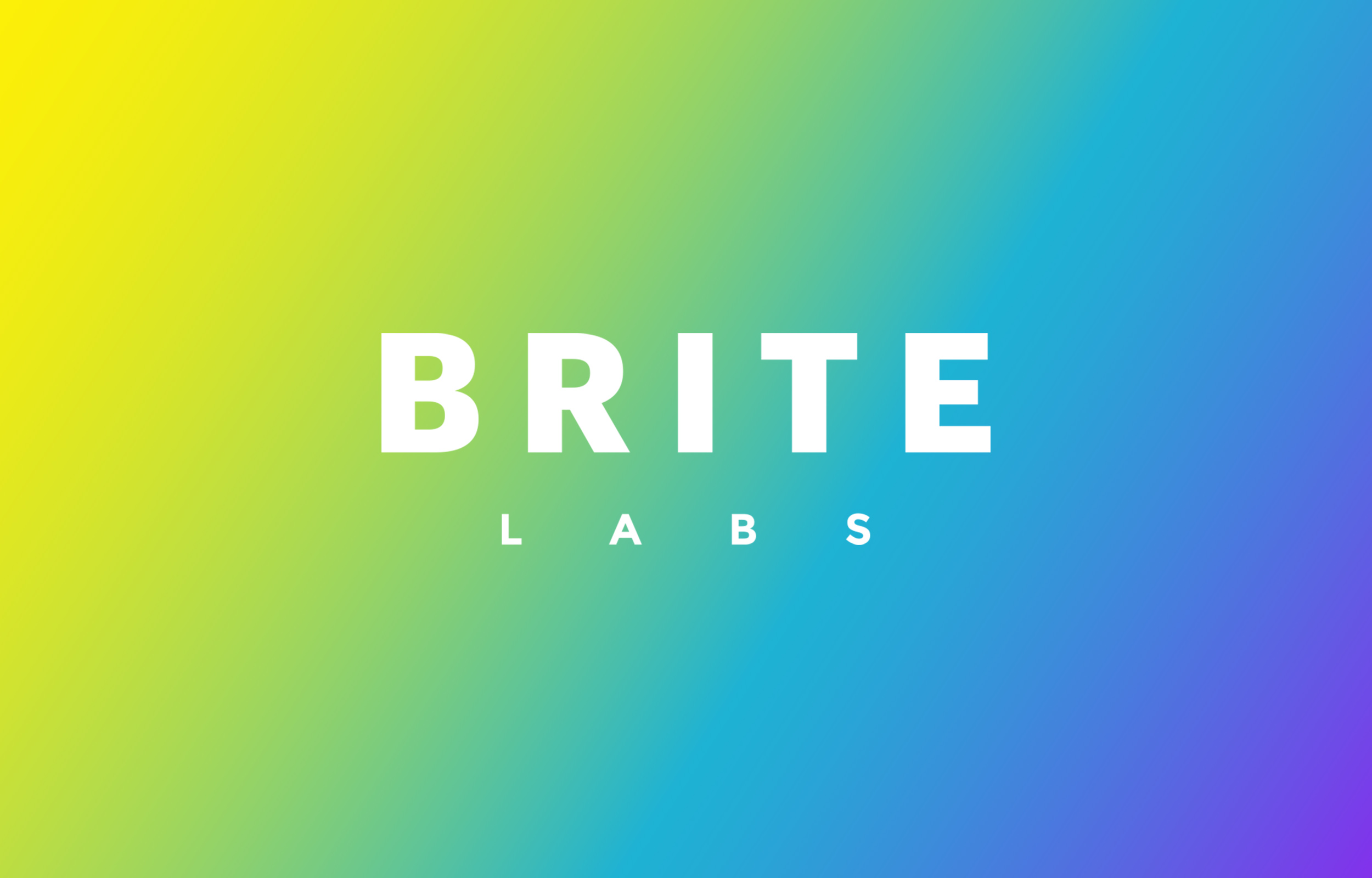
BRITE LabsBranding & Design Direction
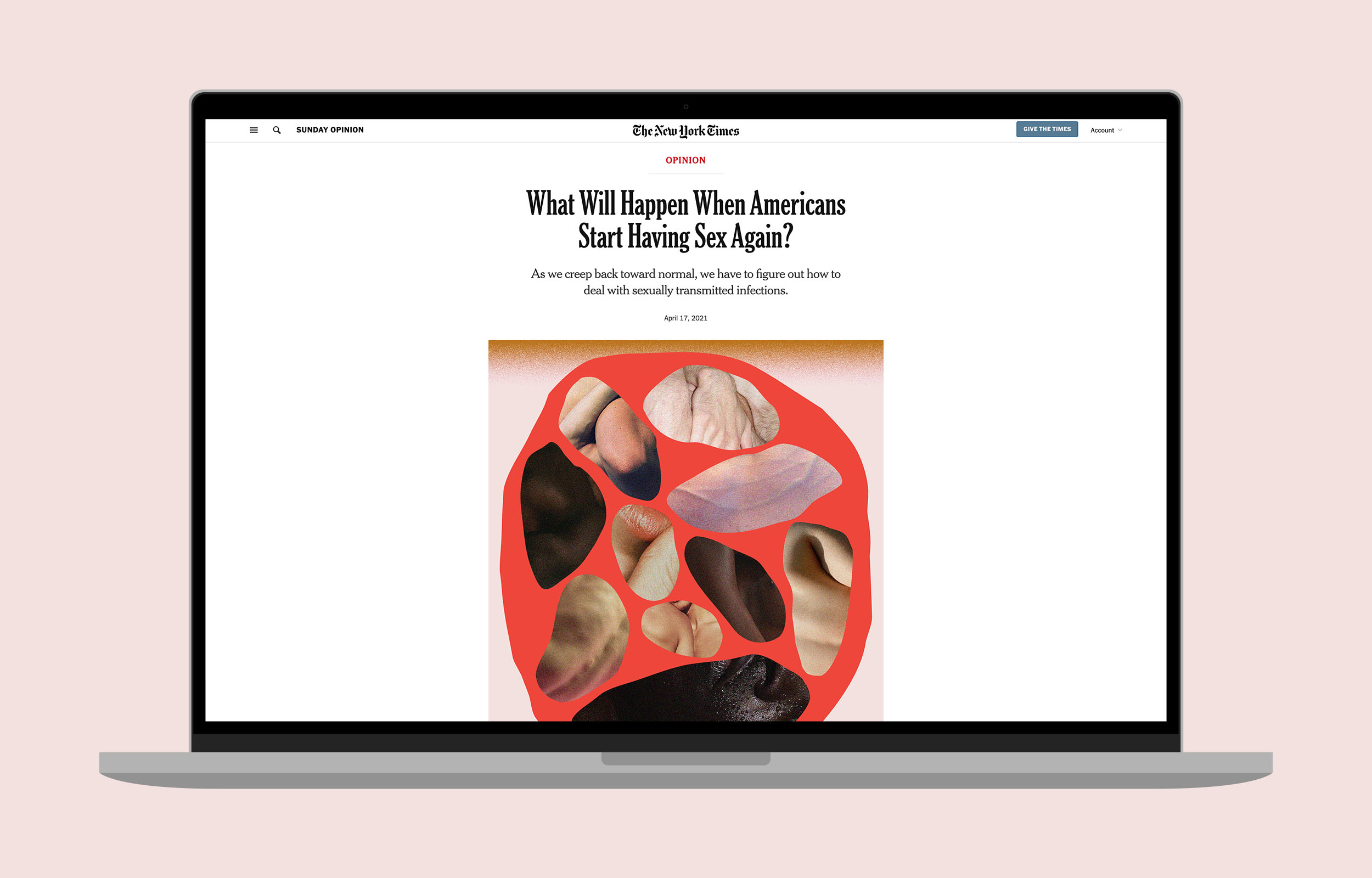
NYTimes OpinionIllustration
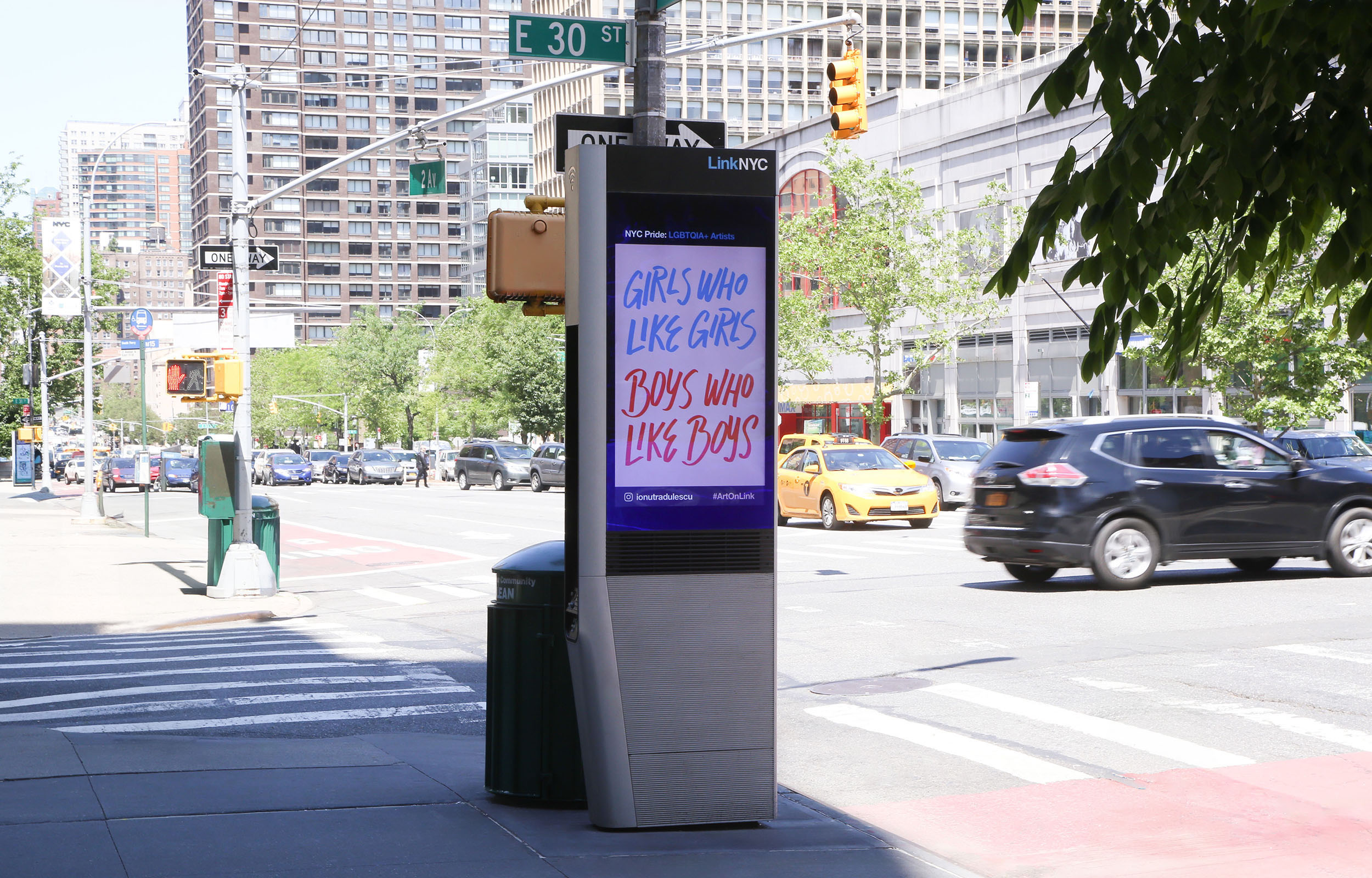
Pride ArtworkLettering & Illustration
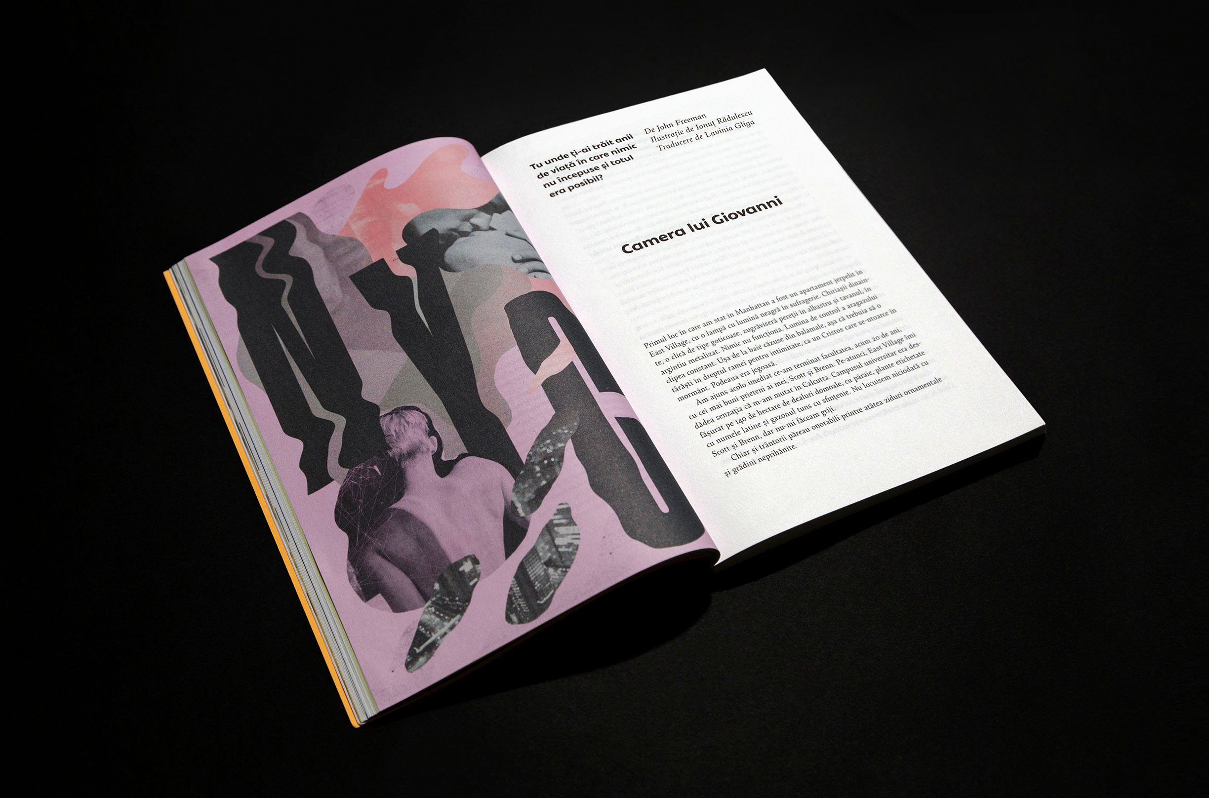
Giovanni’s RoomLettering & Illustration
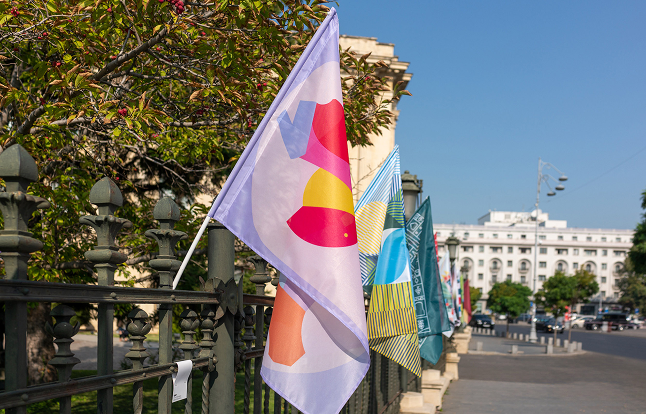
RDW 20Lettering & Illustration
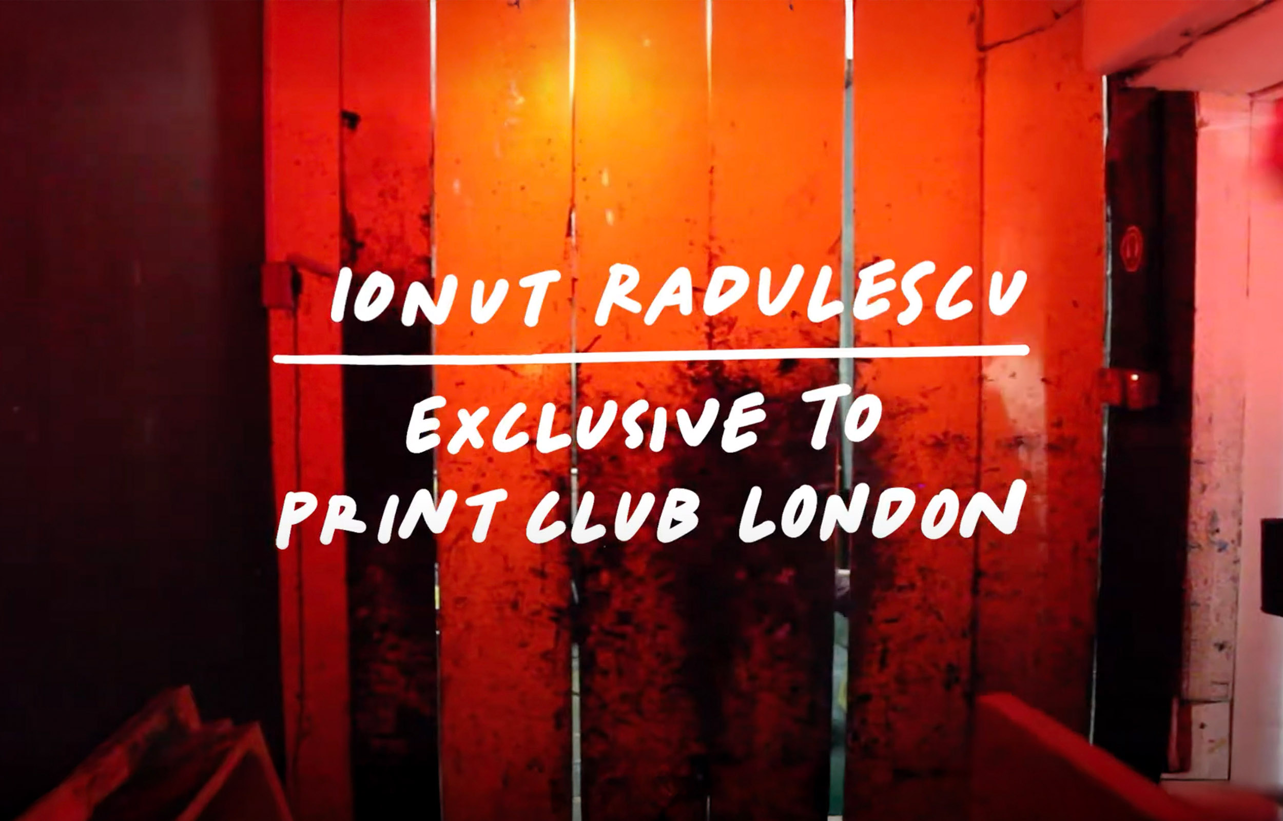
Print Club LondonIllustration
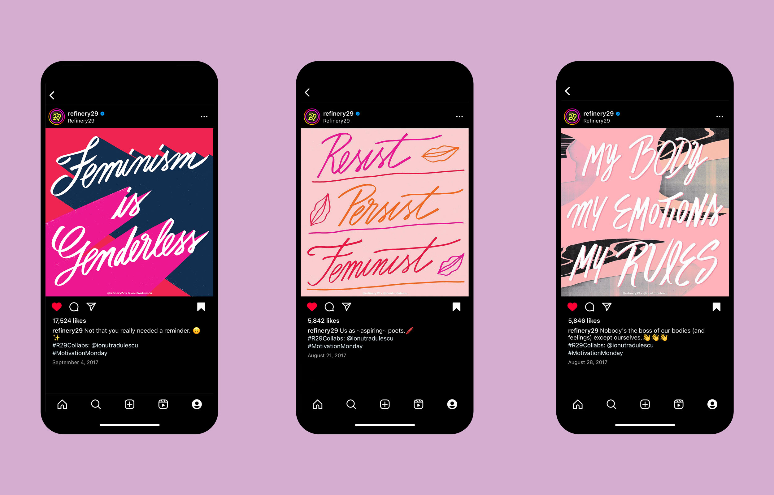
Refinery29 ArtworkLettering & Illustration
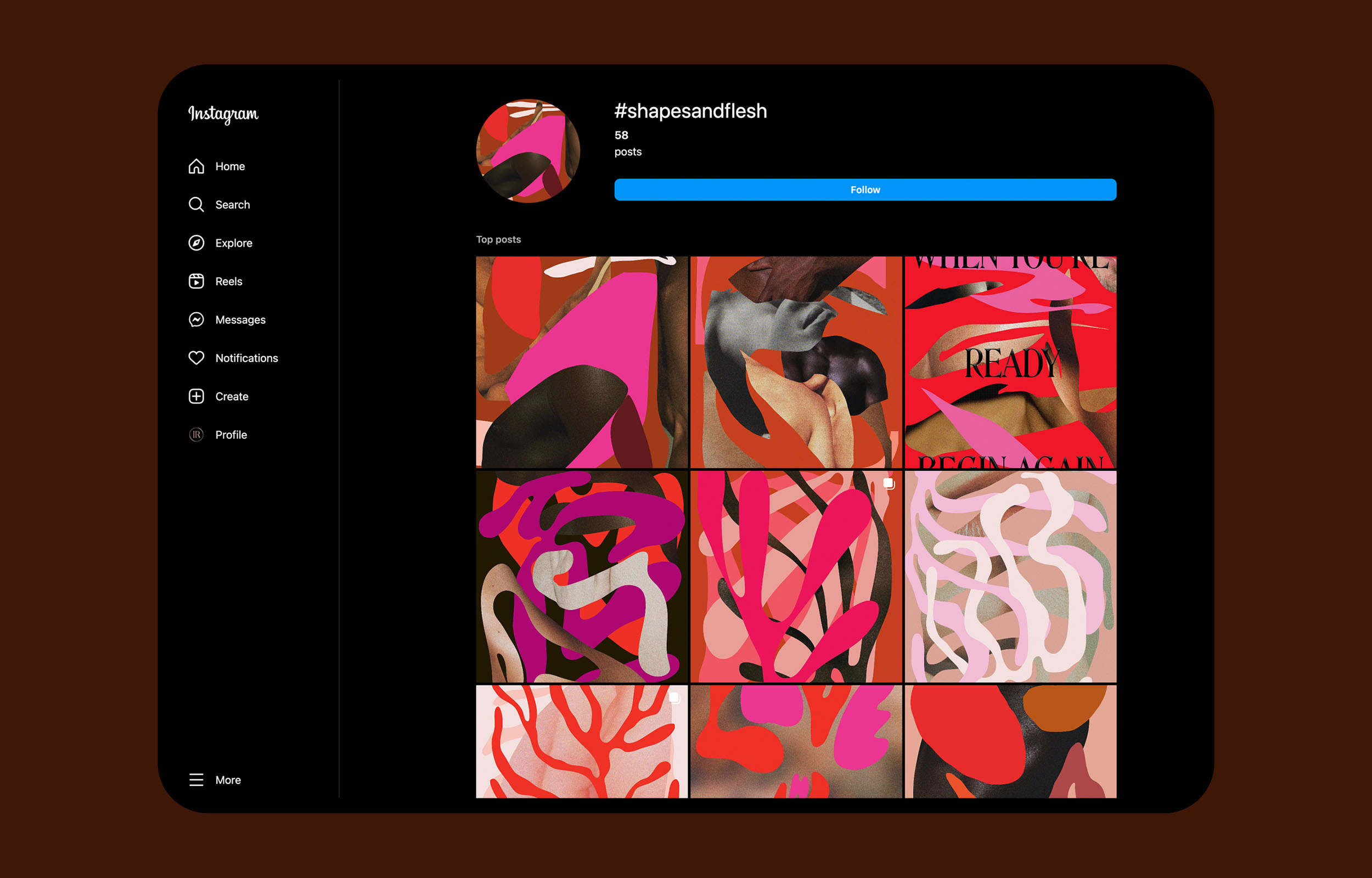
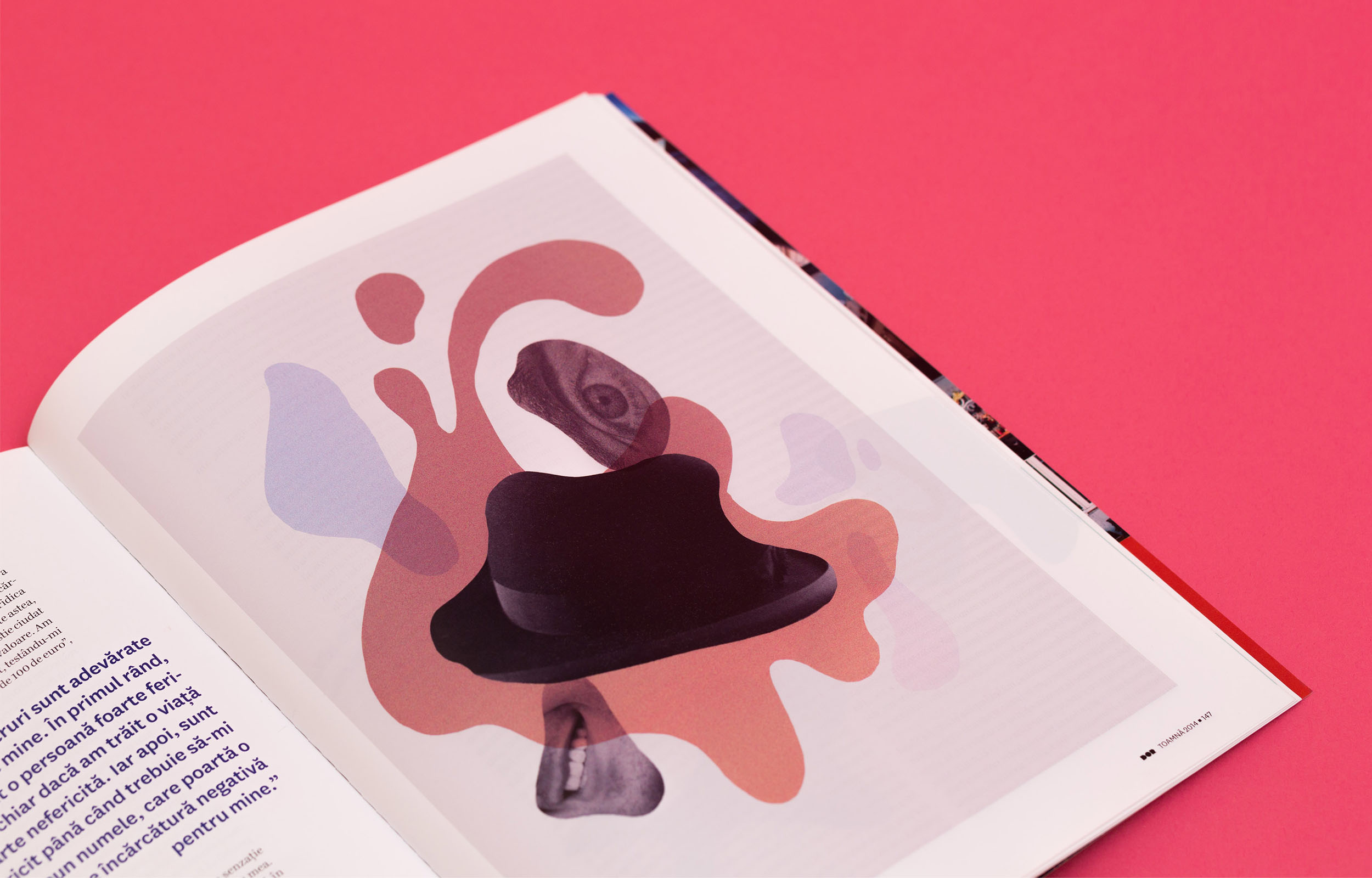
Shapes and FleshIllustration
Good VibesLettering & Illustration
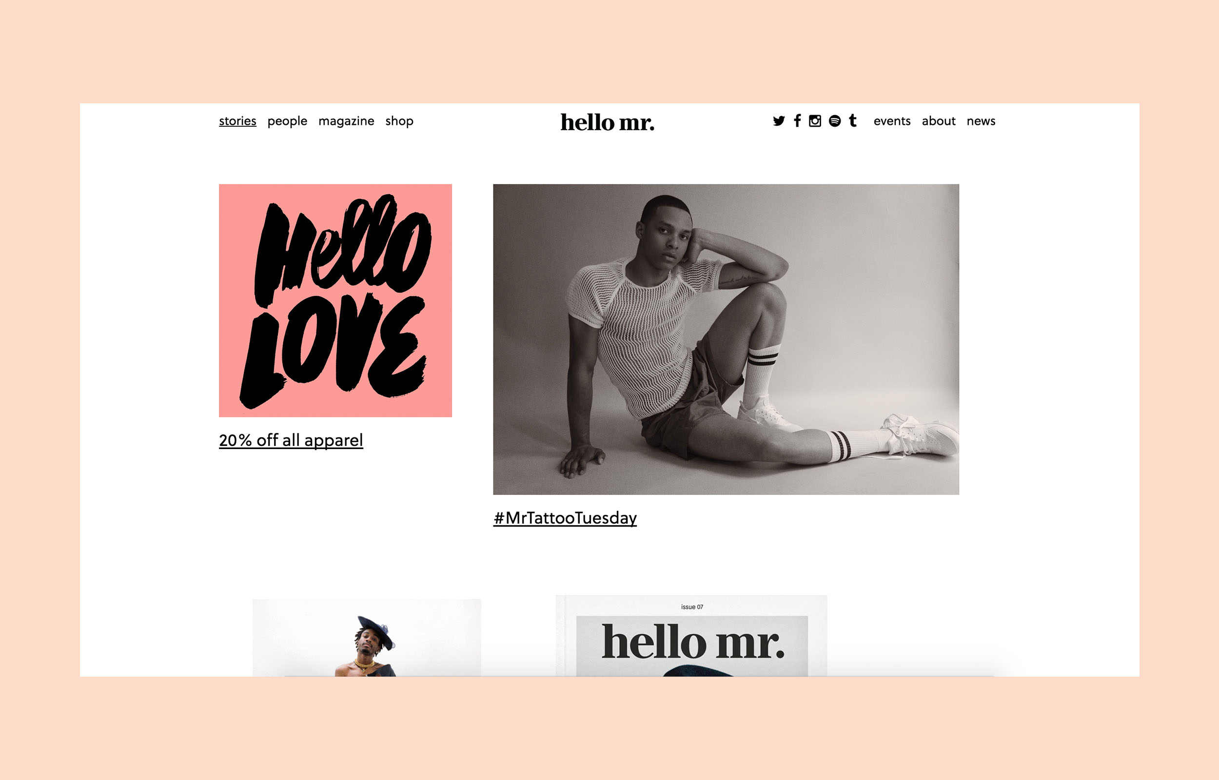
Hello Mr. MagazineLettering & Illustration
Misc. ArtworkLettering & Illustration
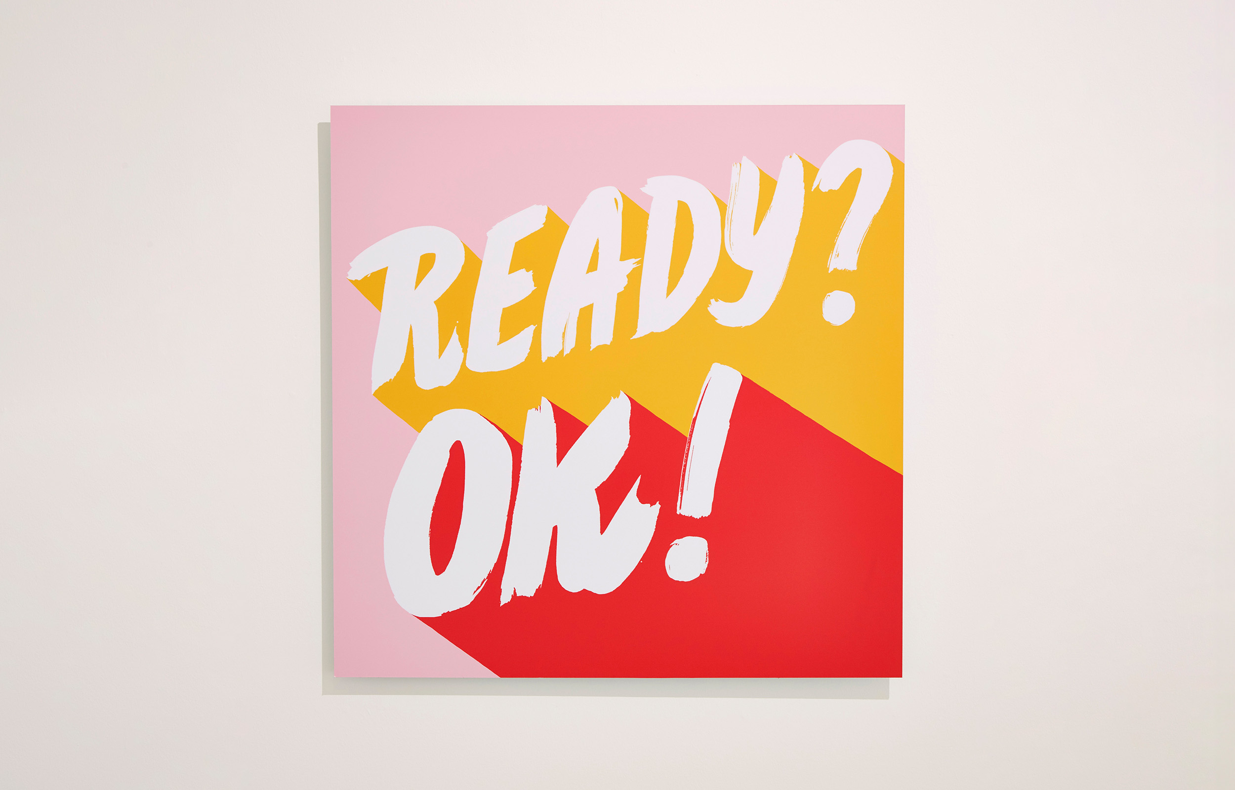
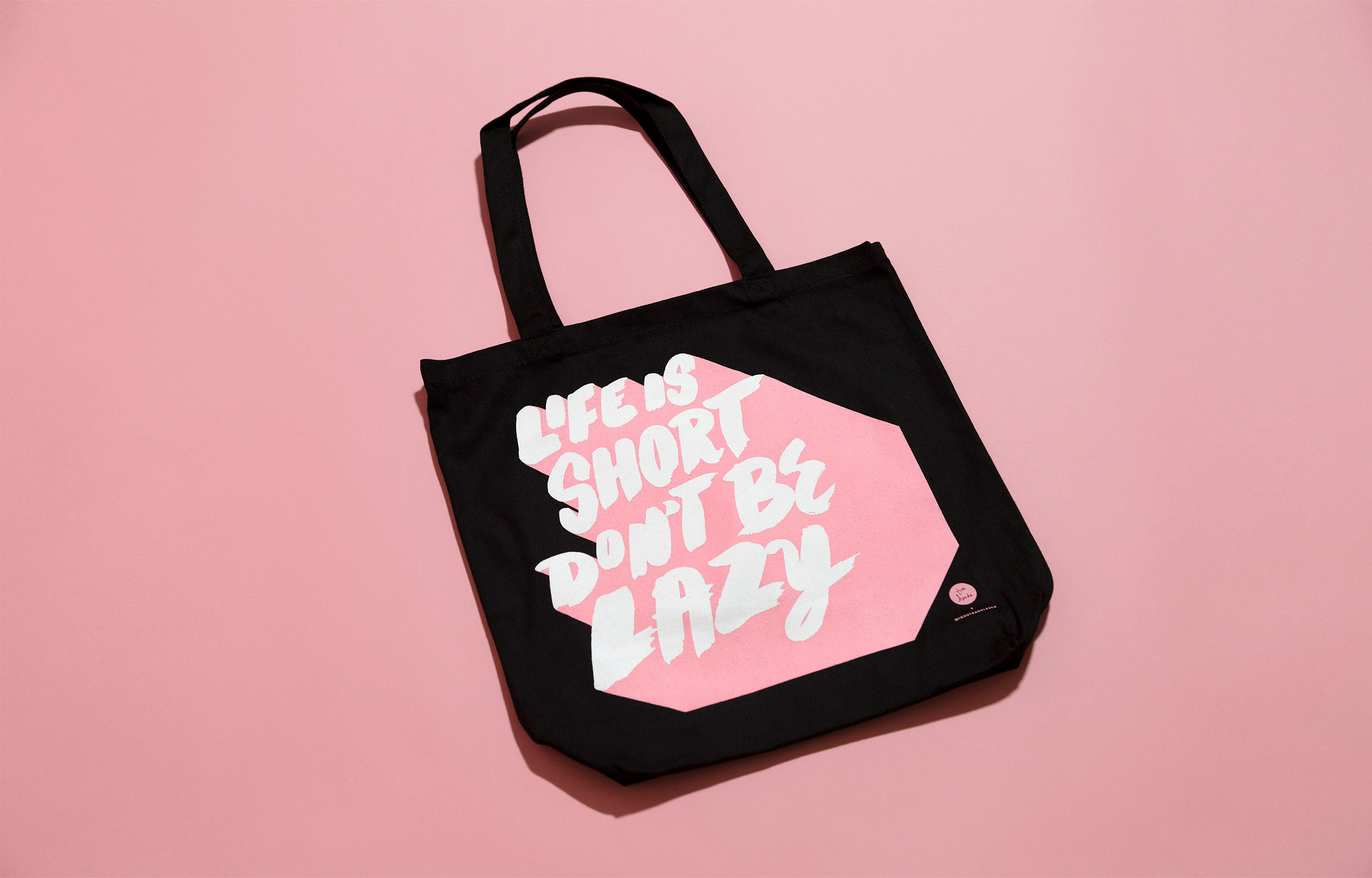
Ready?Ok!Lettering & Illustration
Design*SpongeLettering & Illustration
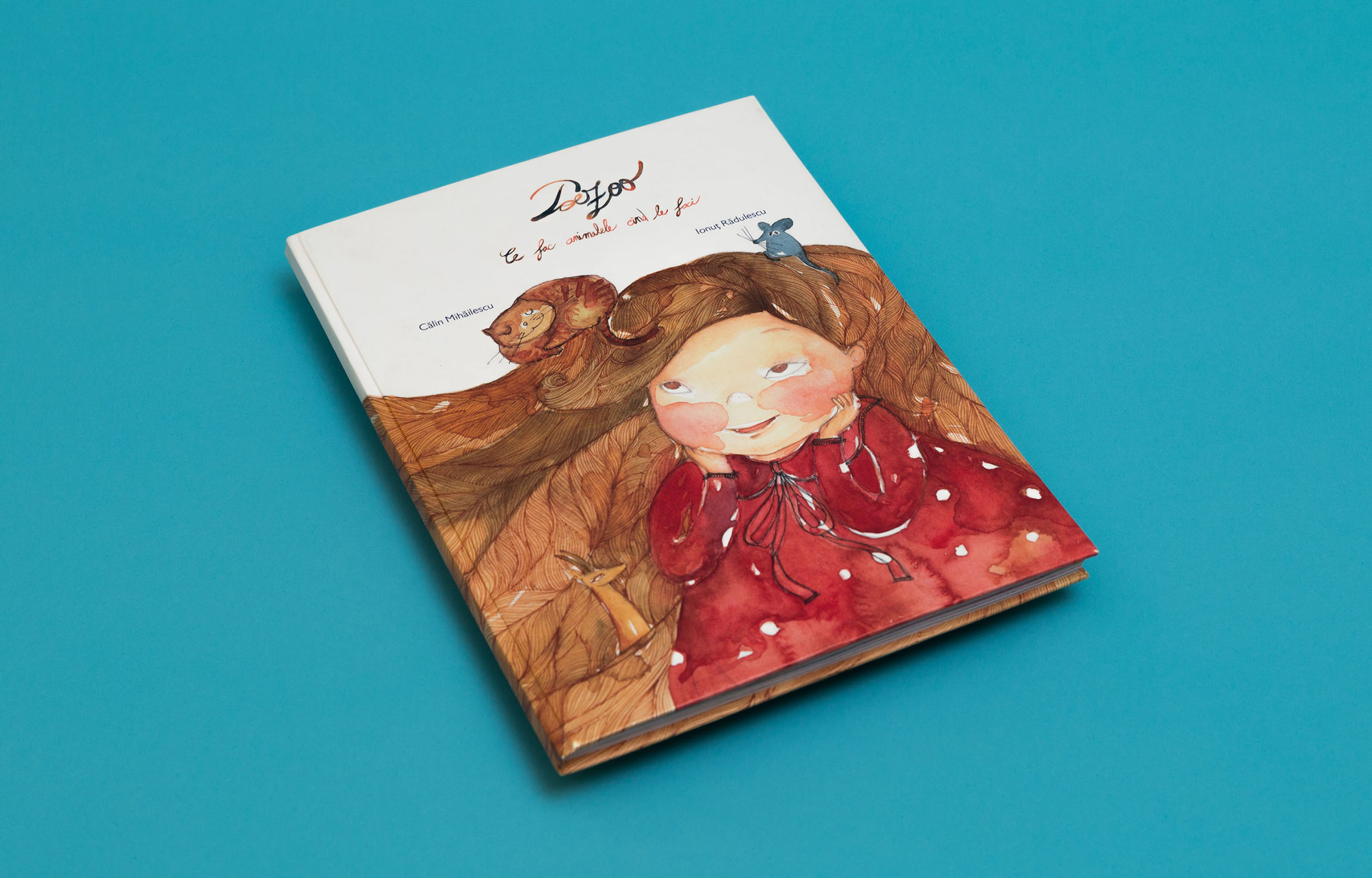
PoezooIllustration & Graphic Design
© 2025 Ionut Radulescu