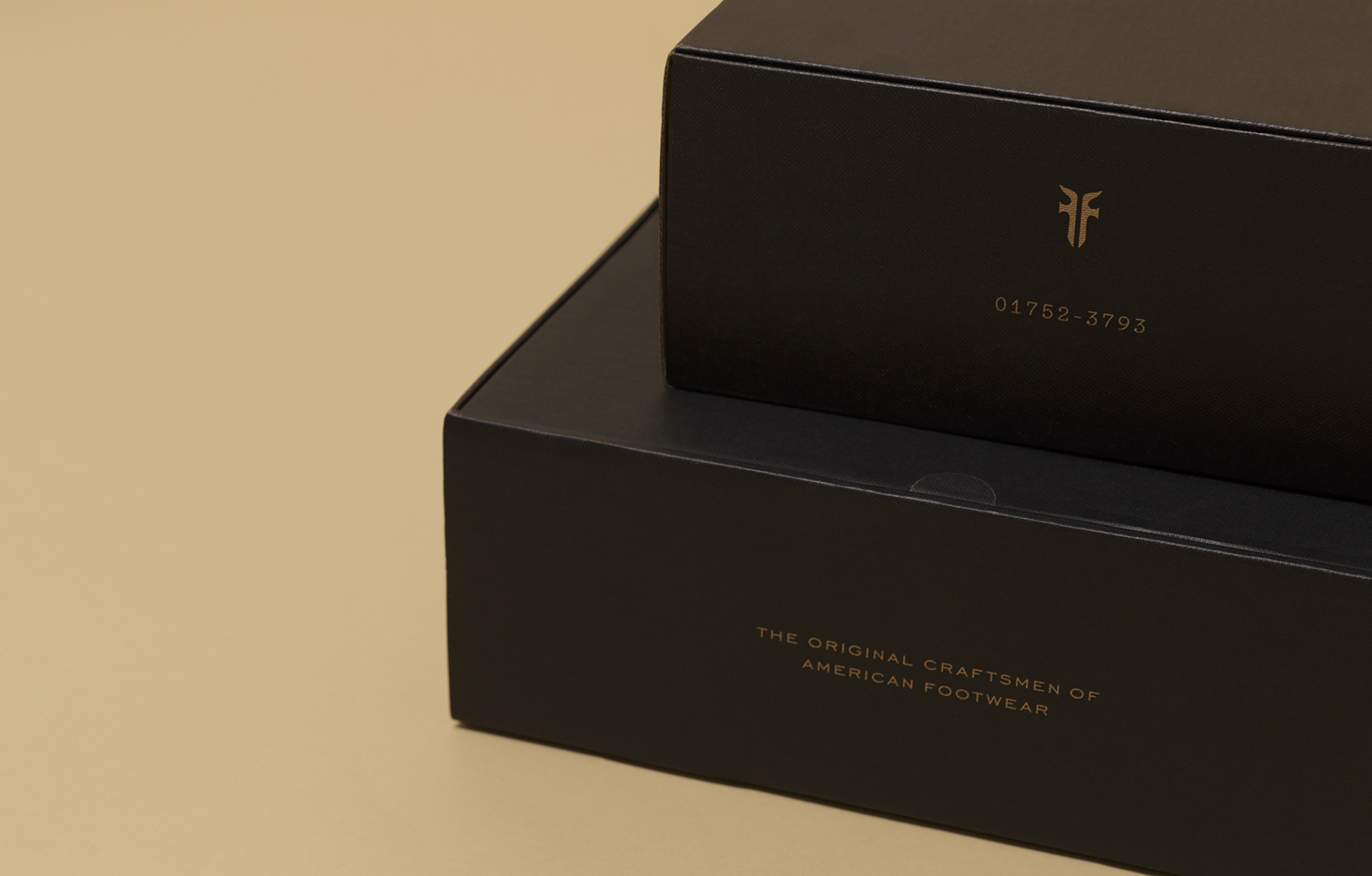
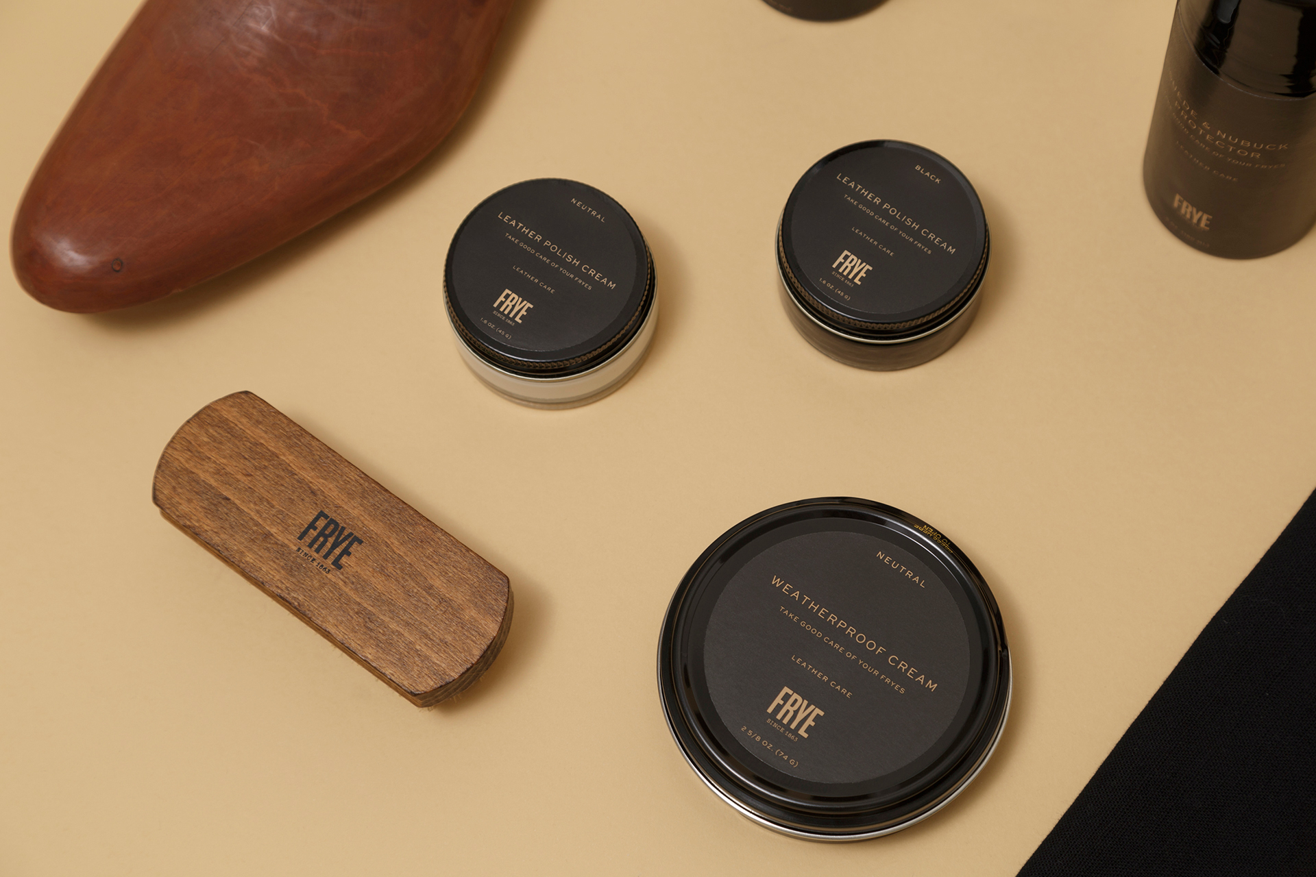
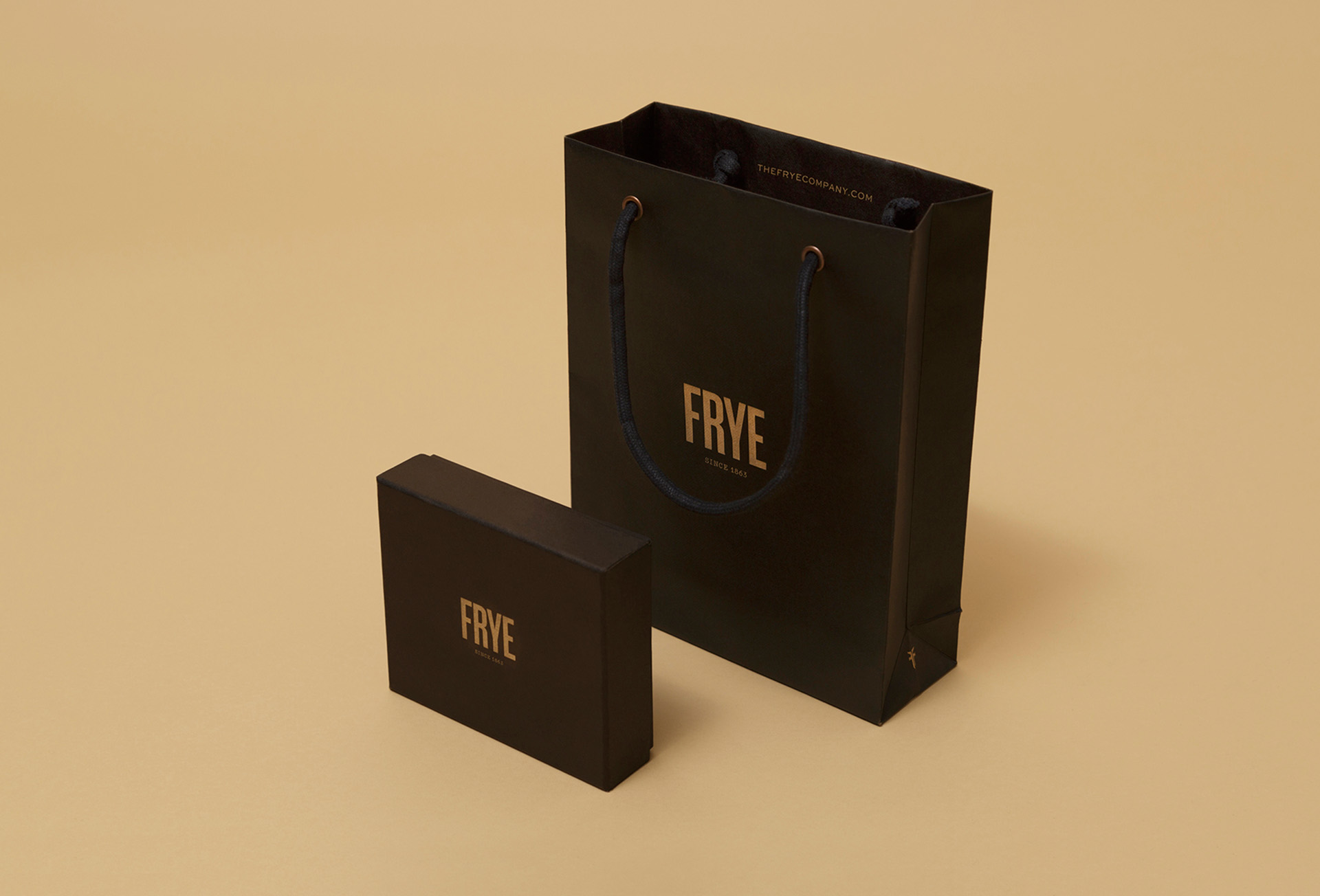
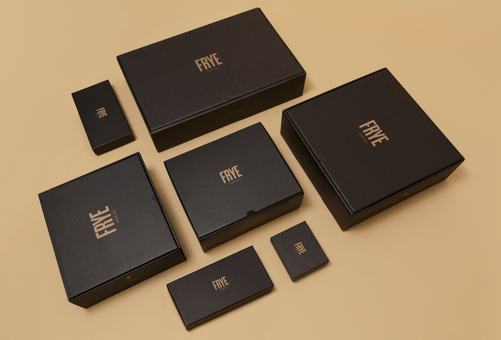
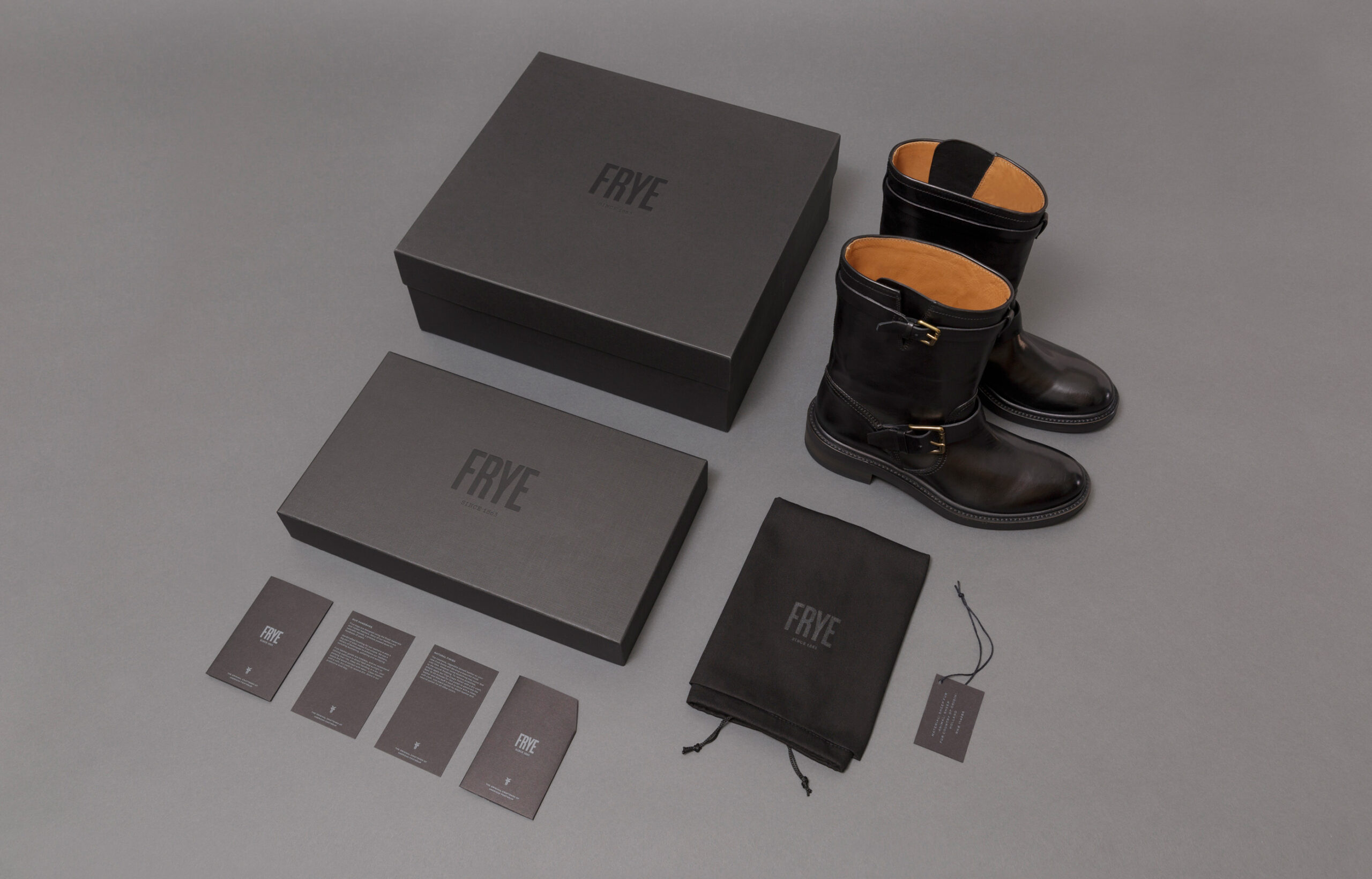
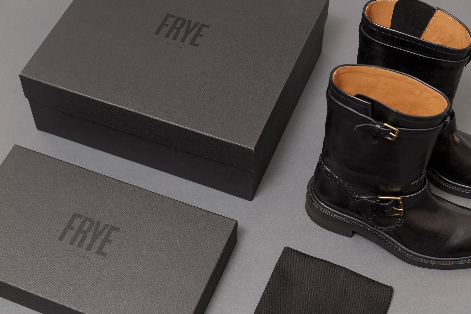
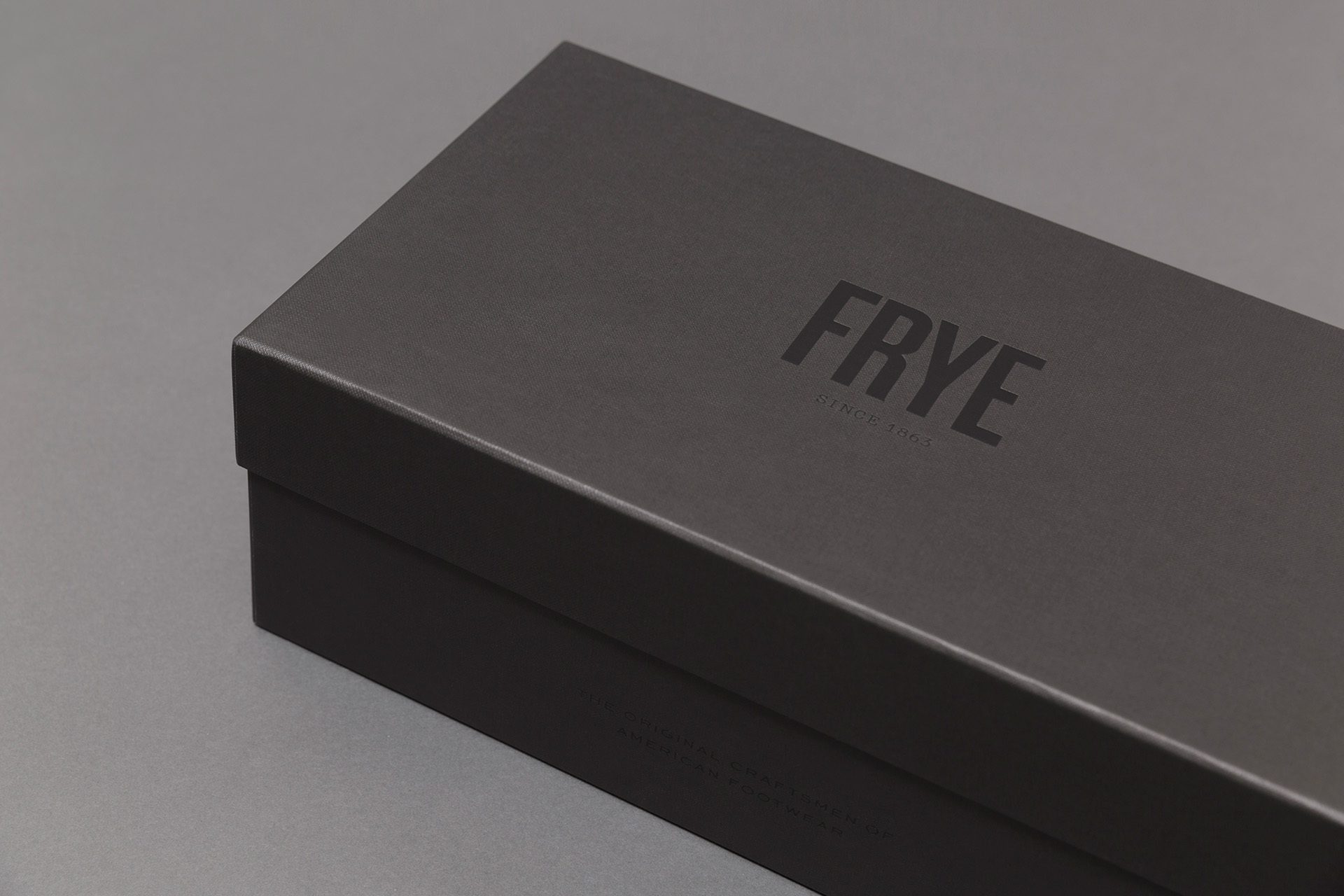
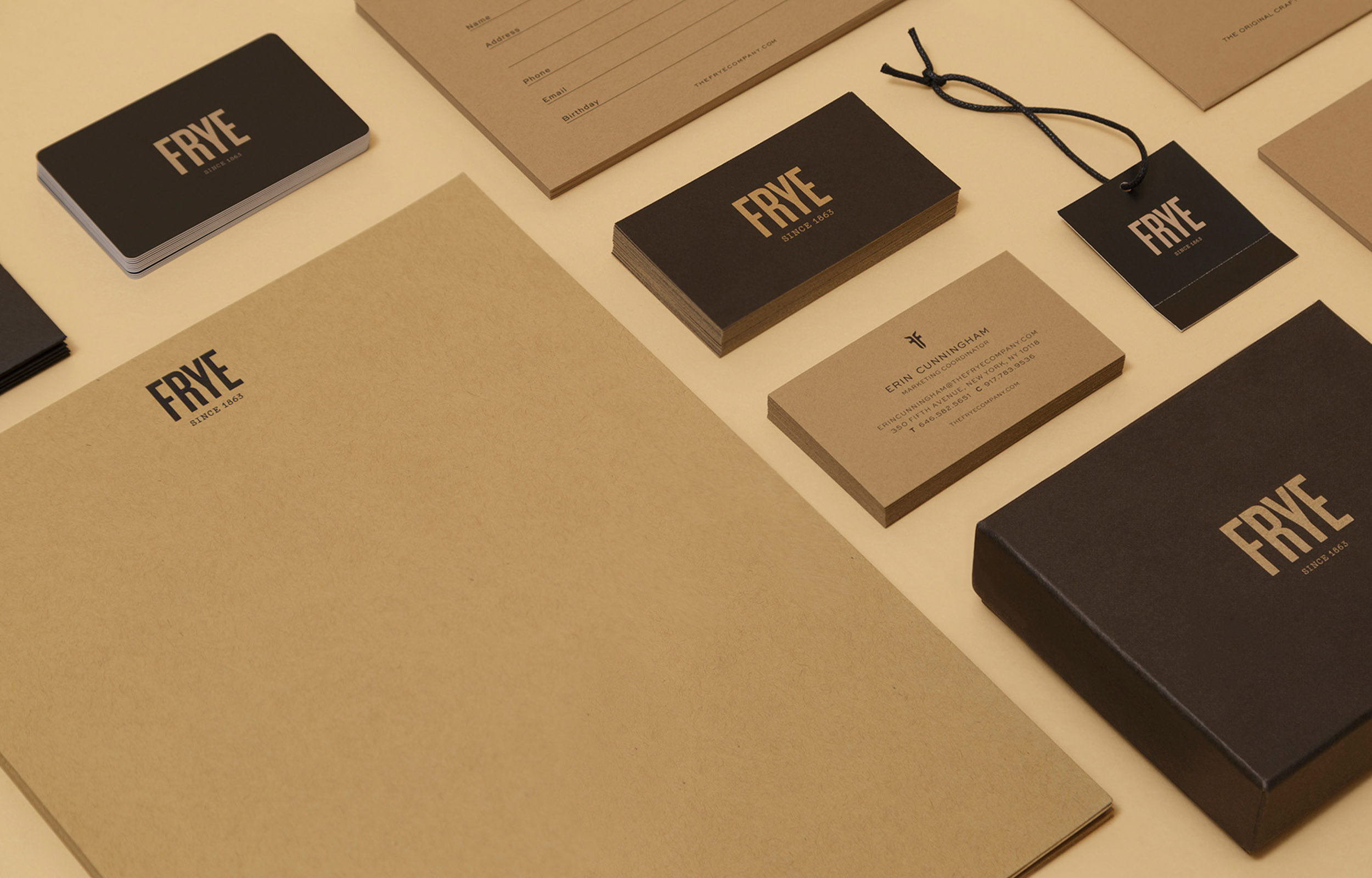
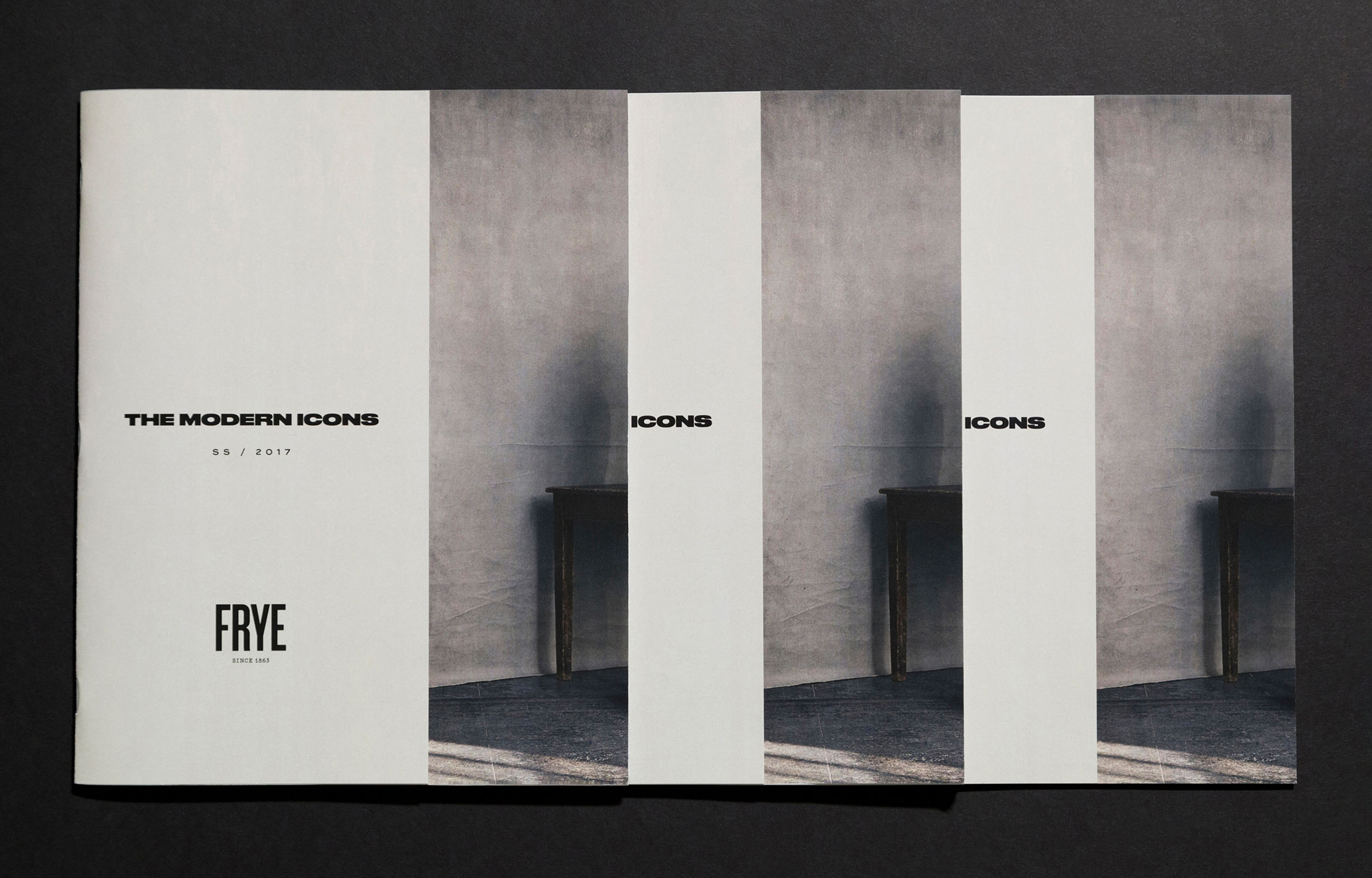
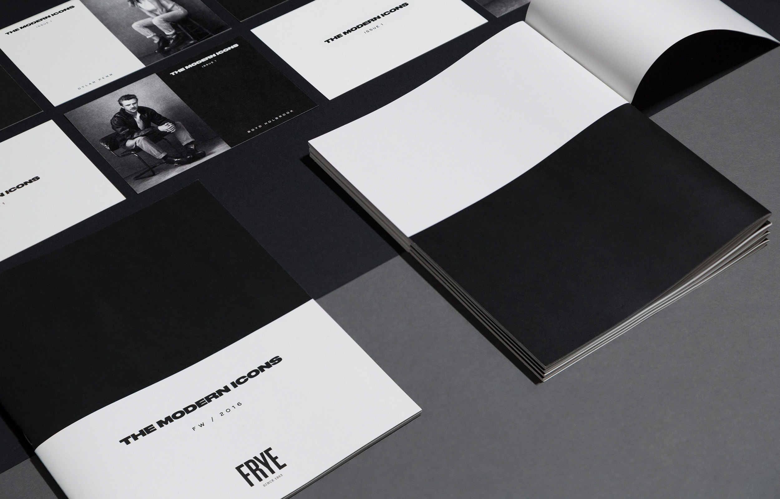
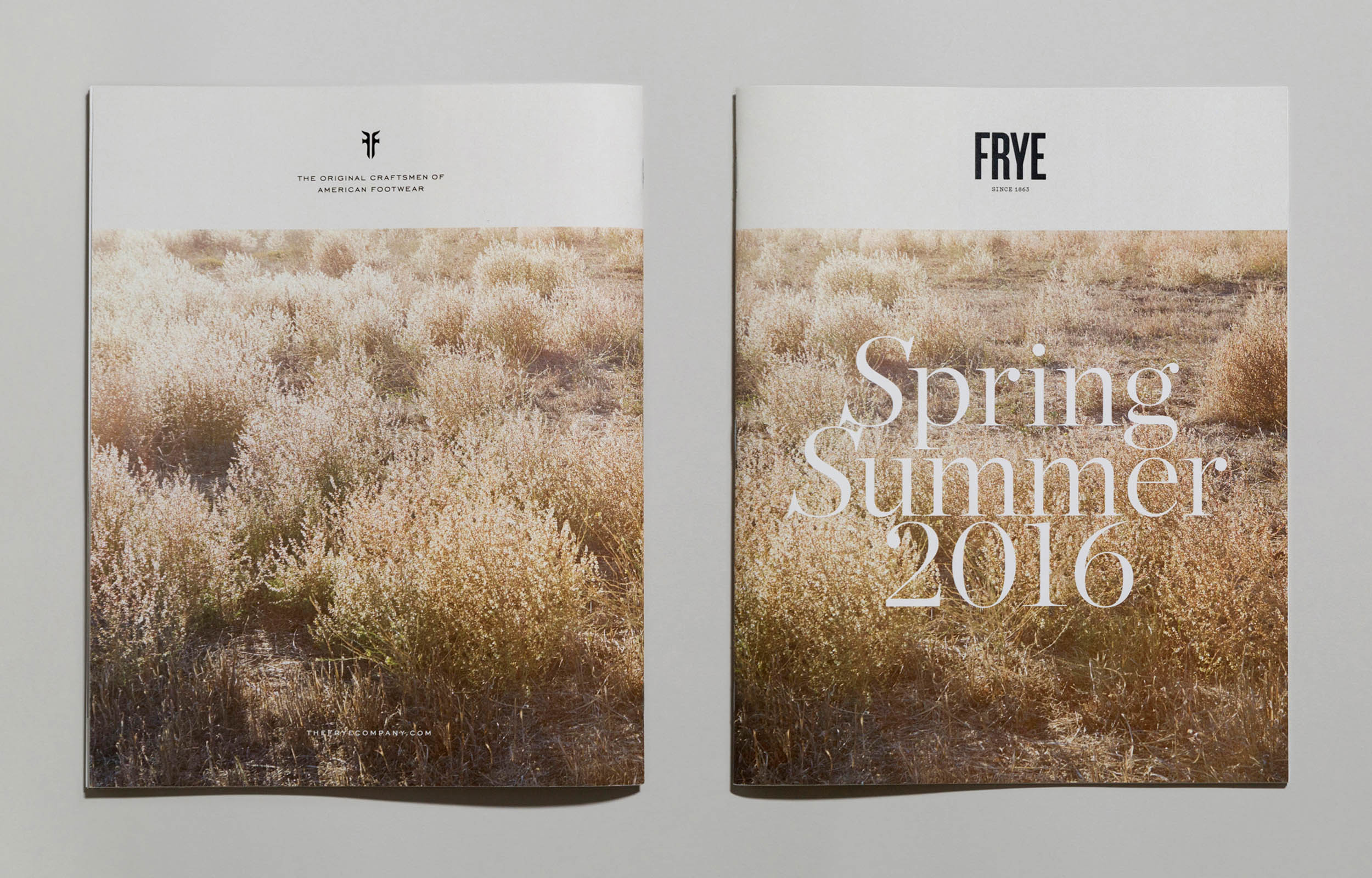
Frye Branding
Founded in 1863, in Marlboro, Massachusetts, The Frye Company has a long history
of making durable leather goods, defined by quality & style, and with a strong presence in
the American footwear landscape. As part of the in-house design team, I worked on the Frye
2016 re-branding, including identity, typography system, collateral, and packaging design.
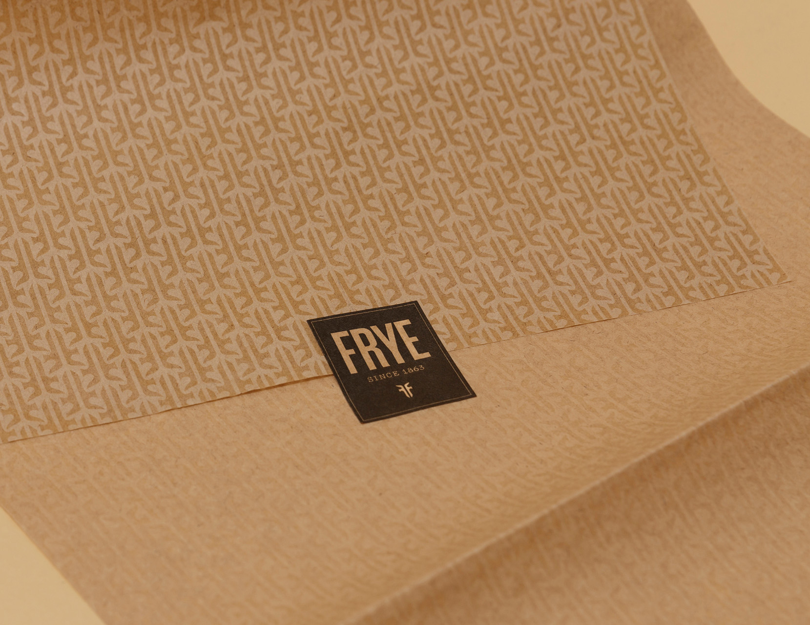
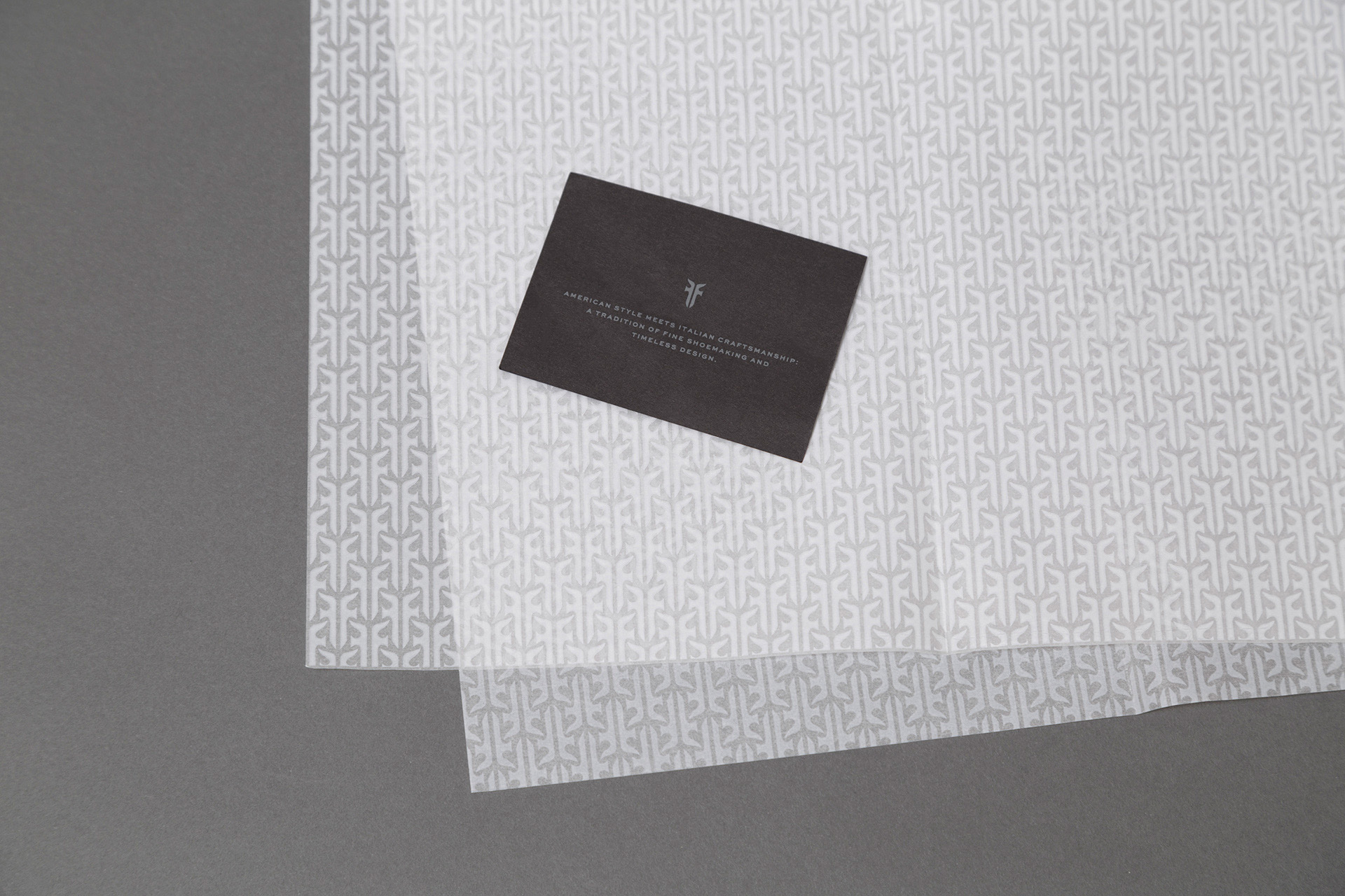
Inspired by the company’s heritage and craftsmanship, the identity reflects its commitment
to quality and iconic design. Combining the artisanal touch of the craft paper with modern
typography, the visual system showcases a contemporary character while elevating Frye
to a timeless footwear brand.
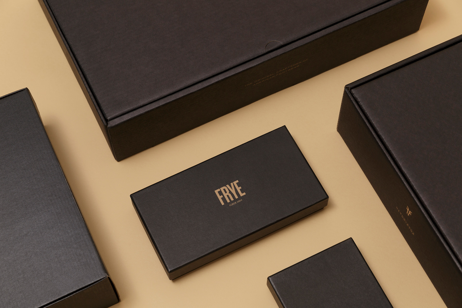
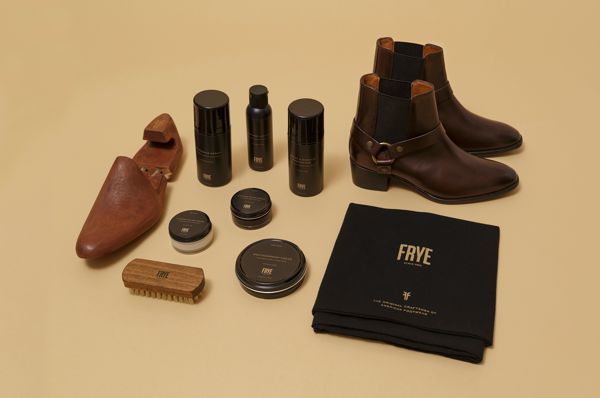
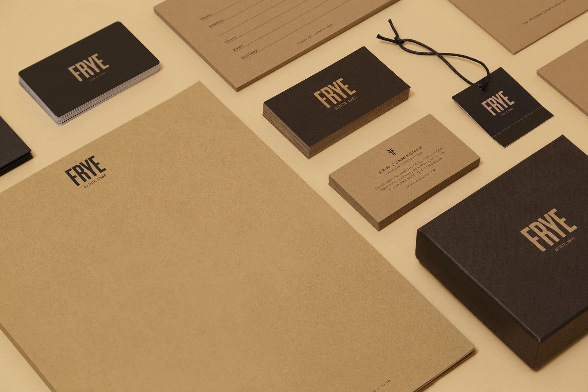
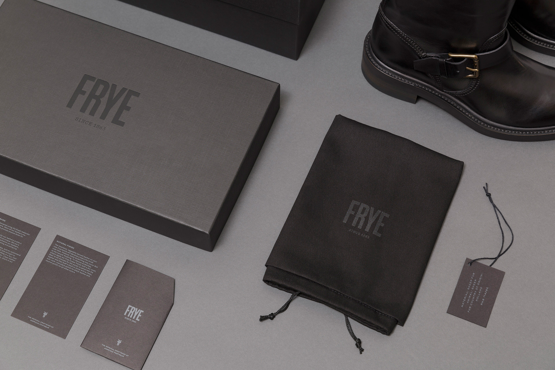
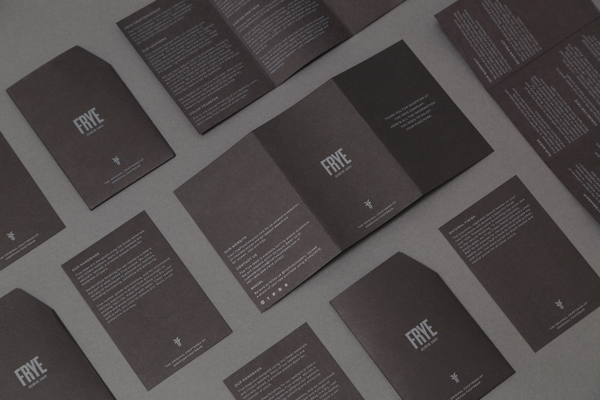
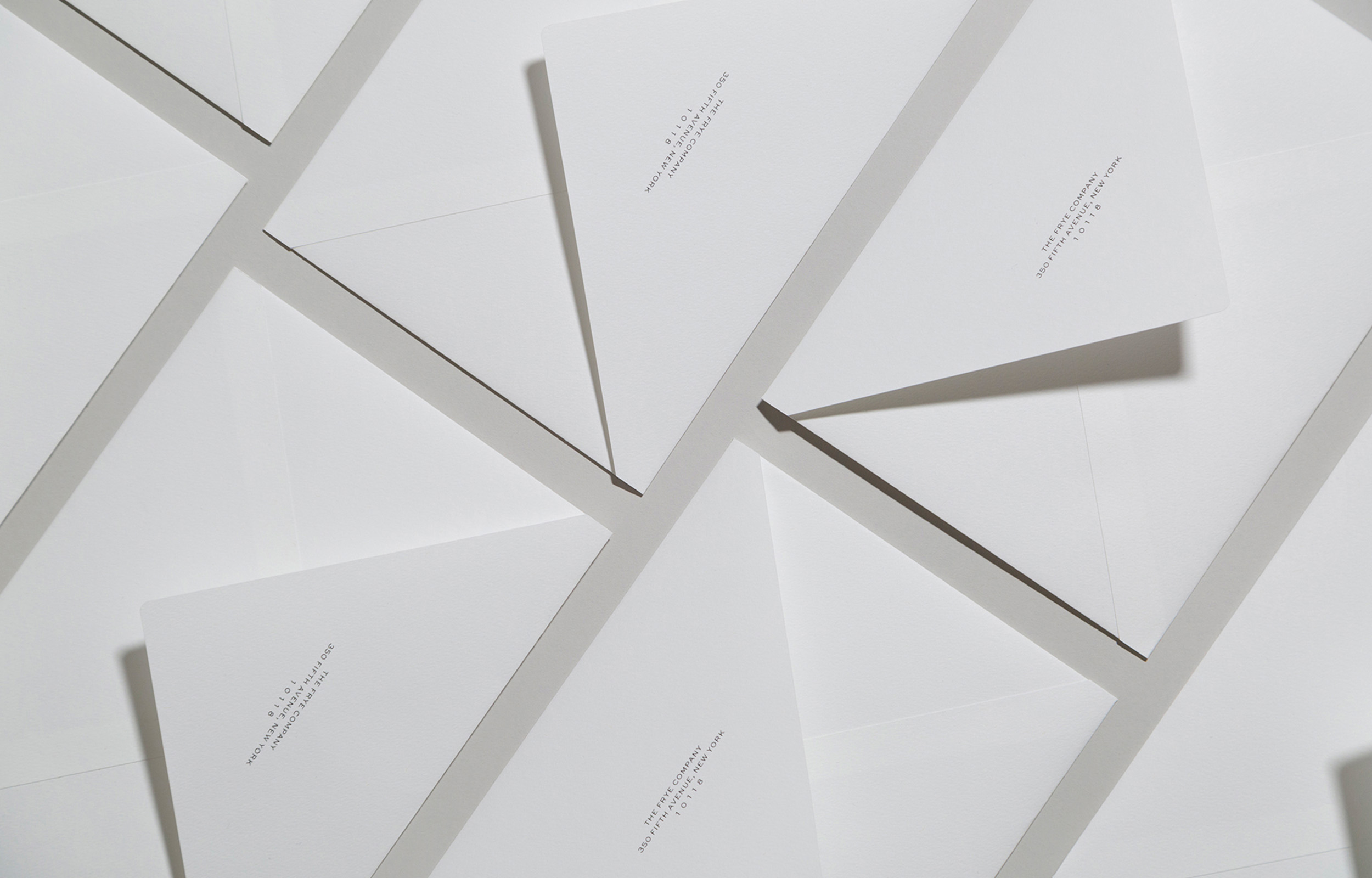
The identity was extended to the entire brand, including retail tags, shoe boxes,
shopping bags and leather-care products.
The design system has been featured on Fonts In Use, a global public archive of typography
showcasing design study cases. The platform documents and examines graphic design
with the goal of improving typographic literacy and appreciation.
Founded in 1863, in Marlboro, Massachusetts, The Frye Company has a long history of making durable leather goods, defined by quality & style, and with a strong presence in the American footwear landscape. As part of the in-house design team, I worked on the Frye
2016 re-branding, including identity, typography system, collateral, and packaging design.
Inspired by the company’s heritage and craftsmanship, the identity reflects its commitment to quality and iconic design. Combining the artisanal touch of the craft paper with modern typography, the visual system showcases a contemporary character while elevating Frye
to a timeless footwear brand.
The identity was extended to the entire brand, including retail tags, shoe boxes, shopping bags and leather-care products.
The design system has been featured on Fonts In Use, a global public archive of typography showcasing design study cases.
The platform documents and examines graphic design
with the goal of improving typographic literacy and appreciation.
The identity was extended to the entire brand, including retail tags, shoe boxes, shopping bags, and leather-care products.
The design system has been featured on Fonts In Use, a global public archive of typography showcasing design study cases.
The platform documents and examines graphic design with the goal of improving typographic literacy and appreciation.
Frye Made in Italy
Frye Made in Italy
Branding and packaging design for Frye’s Made in Italy product line. The exclusive collection features
carefully curated leathers expertly hand-tailored by artisans in the Tuscan region, north of Rome. Referencing the quality
and craftsmanship of the brand, the visual identity system showcases a color palette consisting of black, grey
and white accents, paired with a modern type system, all in a clean layout evoking a luxurious feel, yet rooted in tradition.
Branding and packaging design for the Frye’s Made in Italy product line. The exclusive
collection features carefully curated leathers expertly hand-tailored by artisans in the Tuscan region, north of Rome. Referencing the quality and craftsmanship of the brand, the visual identity
system showcases a color palette consisting of black, grey and white accents, paired with a
modern type system, all in a clean layout evoking a luxurious feel, yet rooted in tradition.
Branding and packaging design for Frye’s Made in Italy
product line. The exclusive collection features carefully curated leathers expertly hand-tailored by artisans in the Tuscan region, north of Rome. Referencing the quality and craftsmanship of the brand, the visual identity system showcases a color palette consisting of black, grey and white accents, paired with a modern type system, all in a clean layout evoking a luxurious feel,
yet rooted in tradition.
Branding and packaging design for Frye’s Made in Italy product line. The exclusive collection features carefully curated leathers expertly hand-tailored by artisans in the Tuscan region, north of Rome. Referencing the quality and craftsmanship of the brand, the visual identity system showcases a color palette consisting of black, grey and white accents, paired with a modern type system, all in a clean layout evoking a luxurious feel, yet rooted in tradition.
ROLE: Graphic Design, Styling & Retouching
CLIENT: The Frye Company
SENIOR DESIGNER: Janine Costagliola
DESIGNER: Lina Ahn
LOGO DESIGN: Wednesday Agency
PRODUCT PHOTOGRAPHY: Rudolf Costin
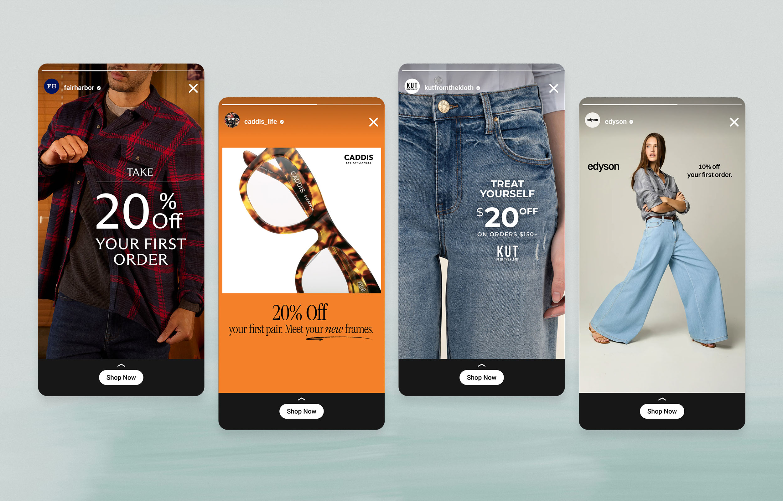
Paid Social CreativeBranding & Digital Ad Design
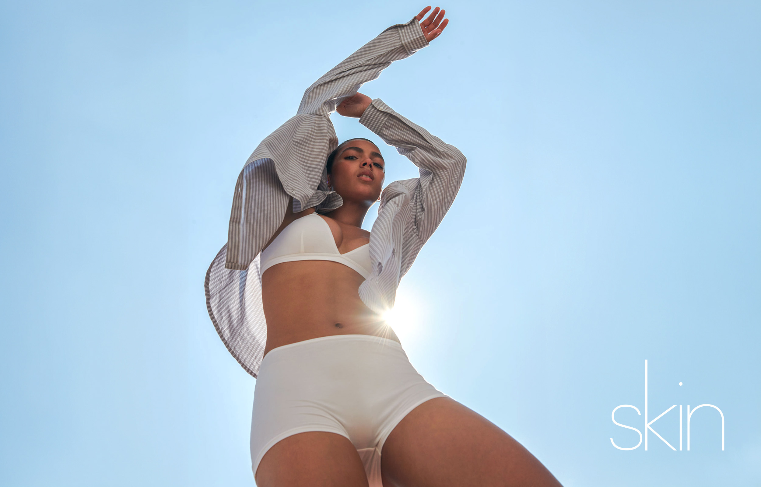
SkinBranding & Digital Design
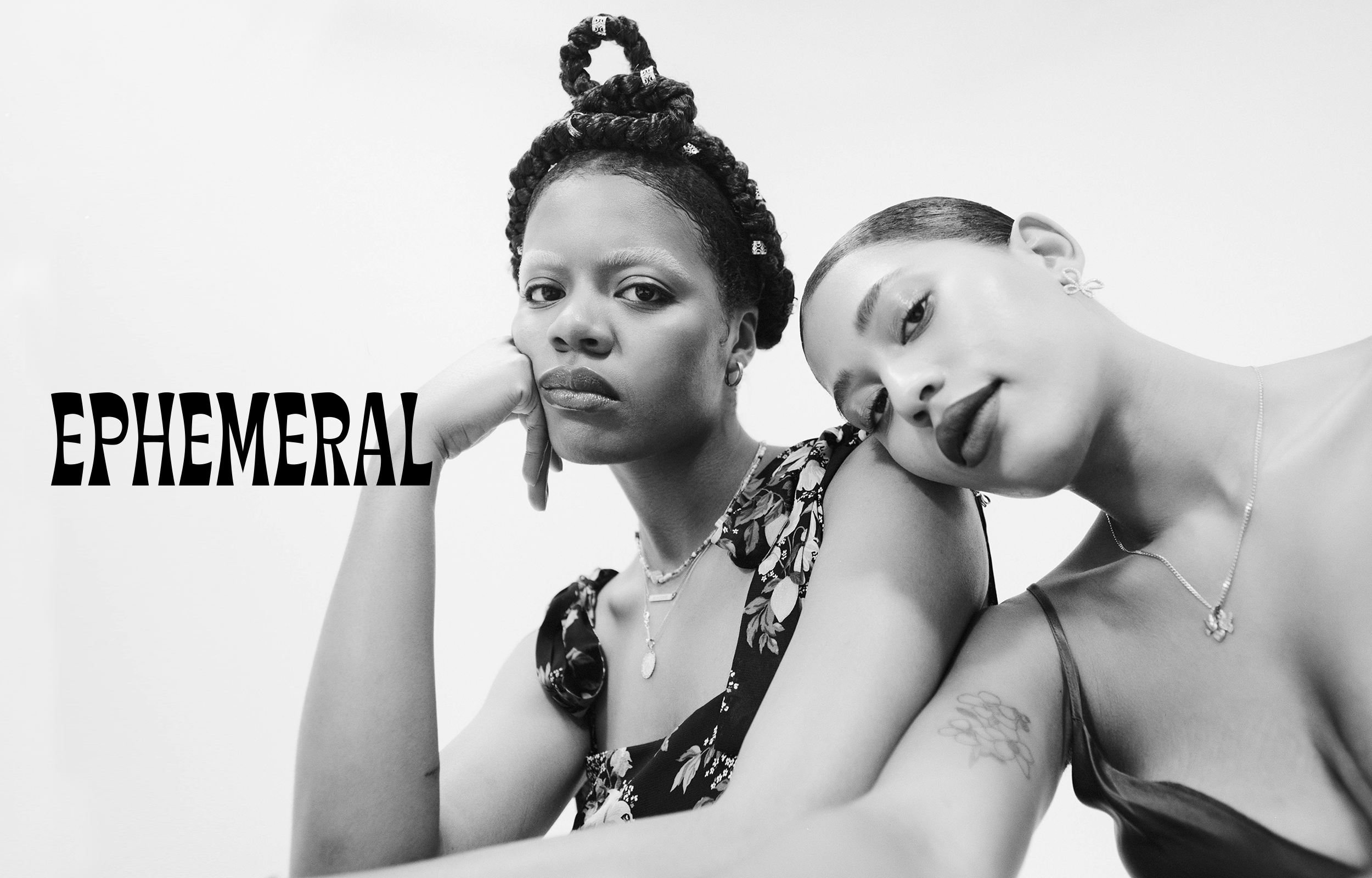
EphemeralBranding & Digital Design
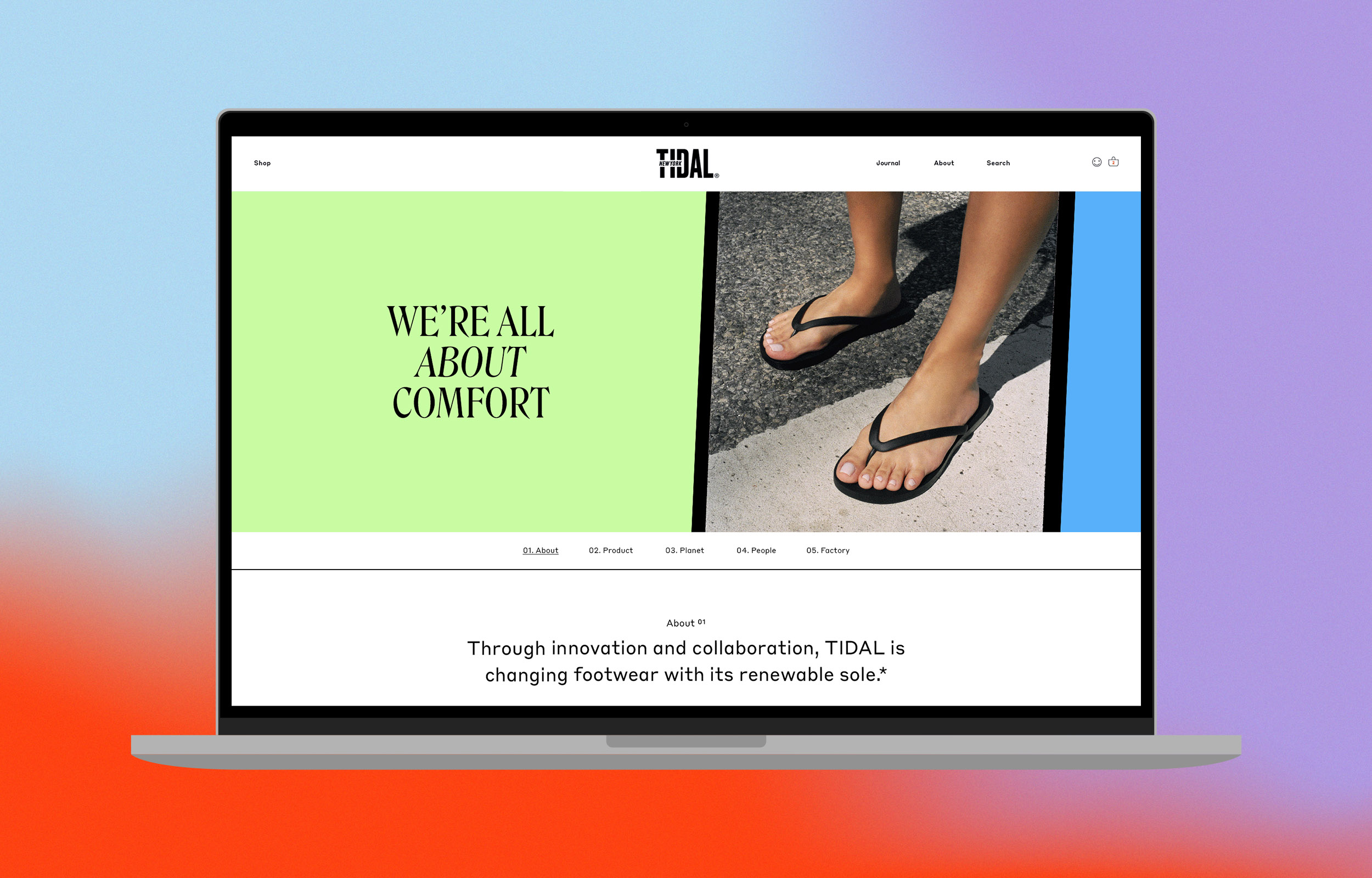
TIDAL About Us-DigitalBranding & Web Design
TIDAL Emails & SocialBranding & Digital Design
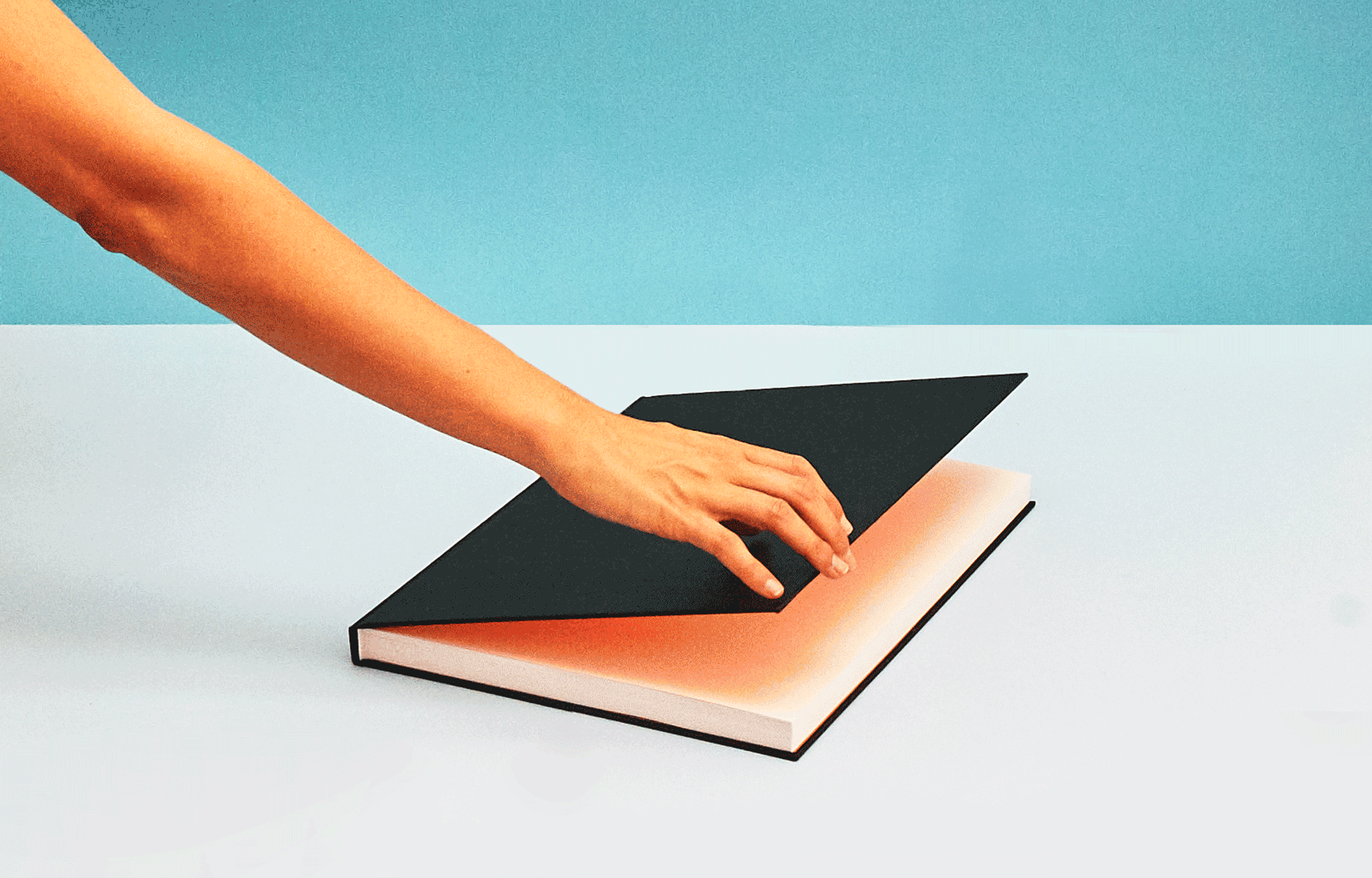
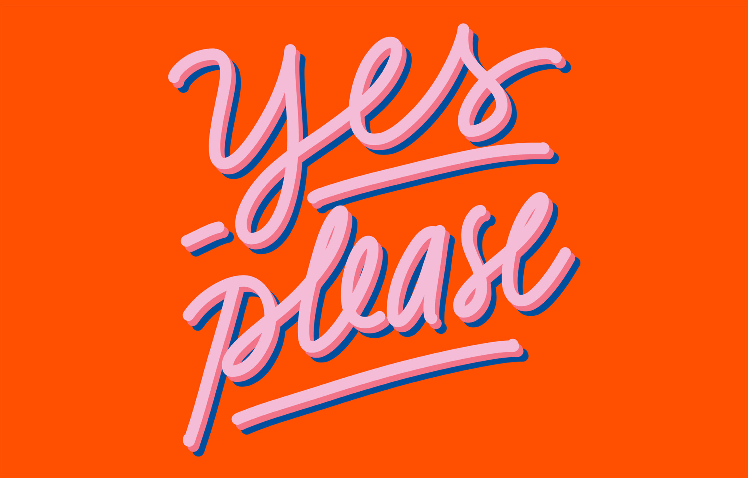
Palette LetteringIllustration
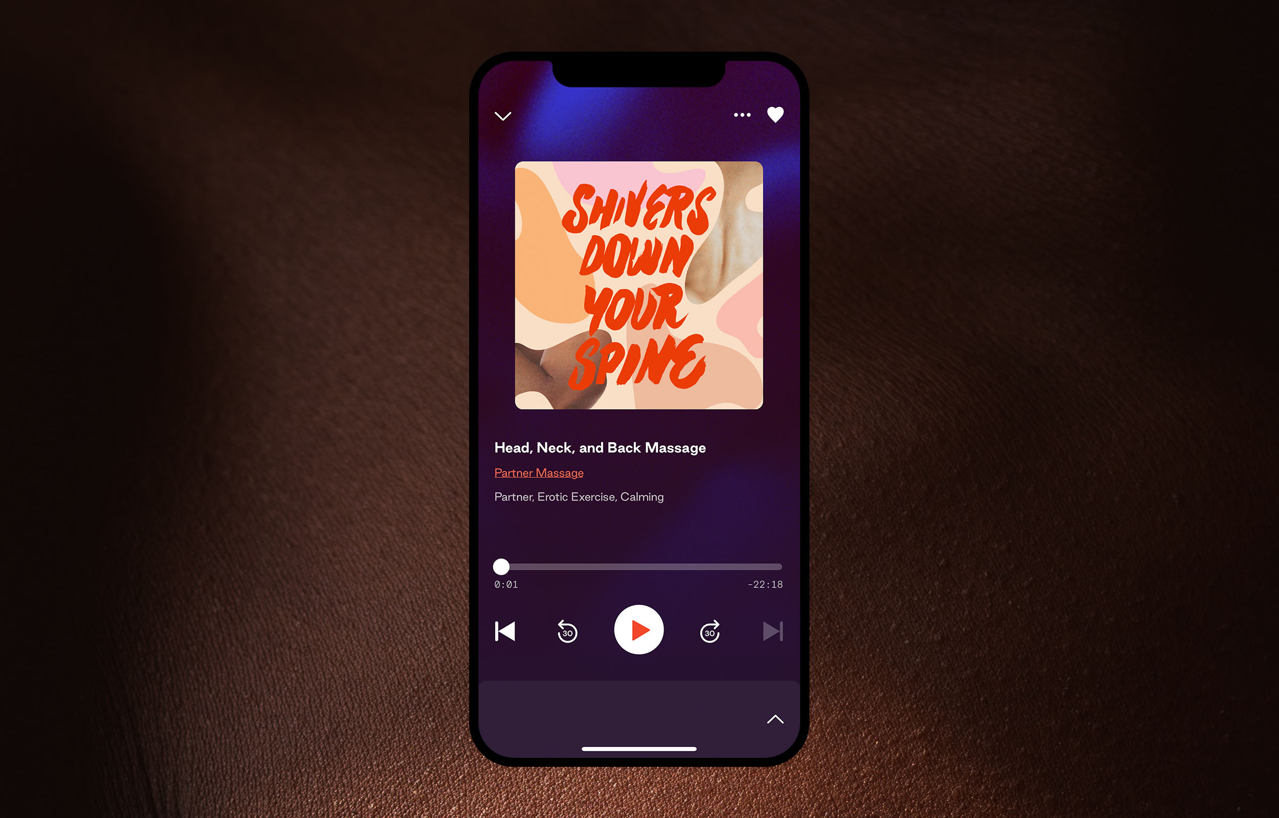
DipseaIllustration
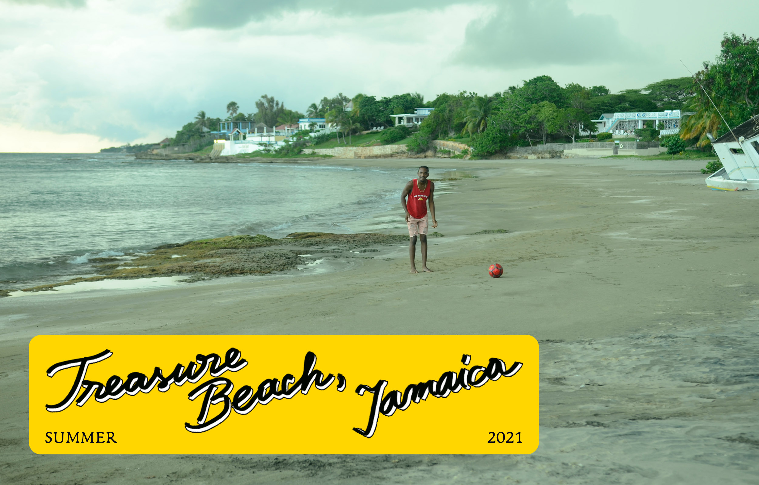
TIDAL Jamaica EditorialDigital Design
TIDAL Discovery PageWeb Design
Frye BrandingGraphic Design
Frye SS/17 LookbookDesign
Frye FW/16 LookbookDesign
Frye SS/16 LookbookDesign
Frye Events CollateralDesign
BRITE LabsBranding & Design Direction
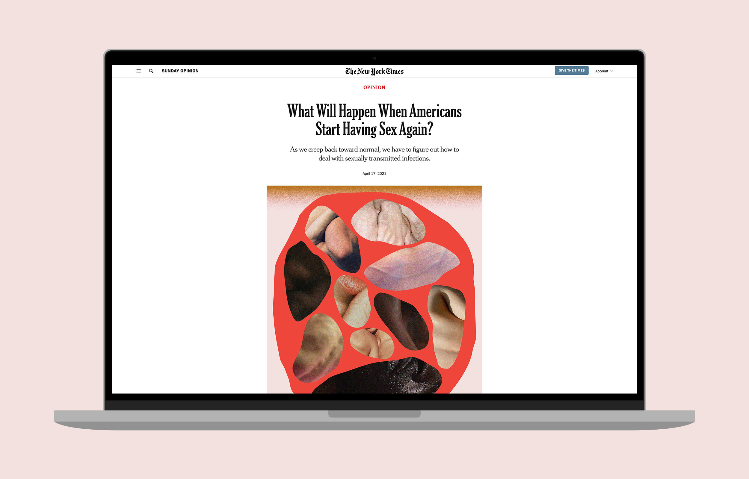
NYTimes OpinionIllustration
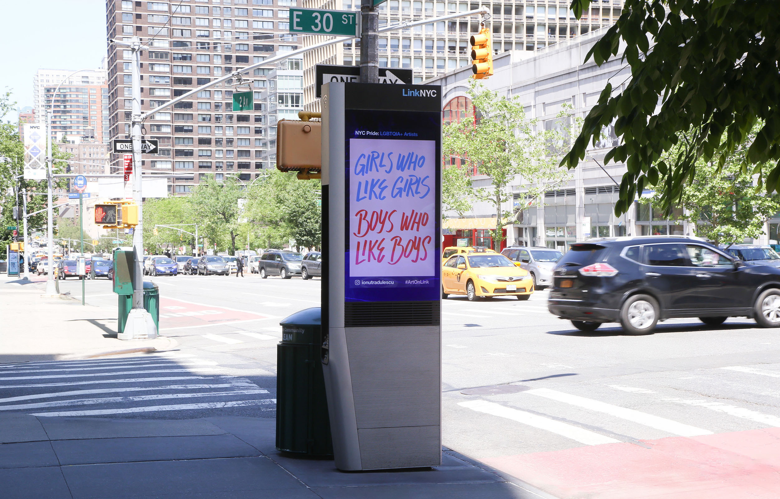
Pride ArtworkLettering & Illustration
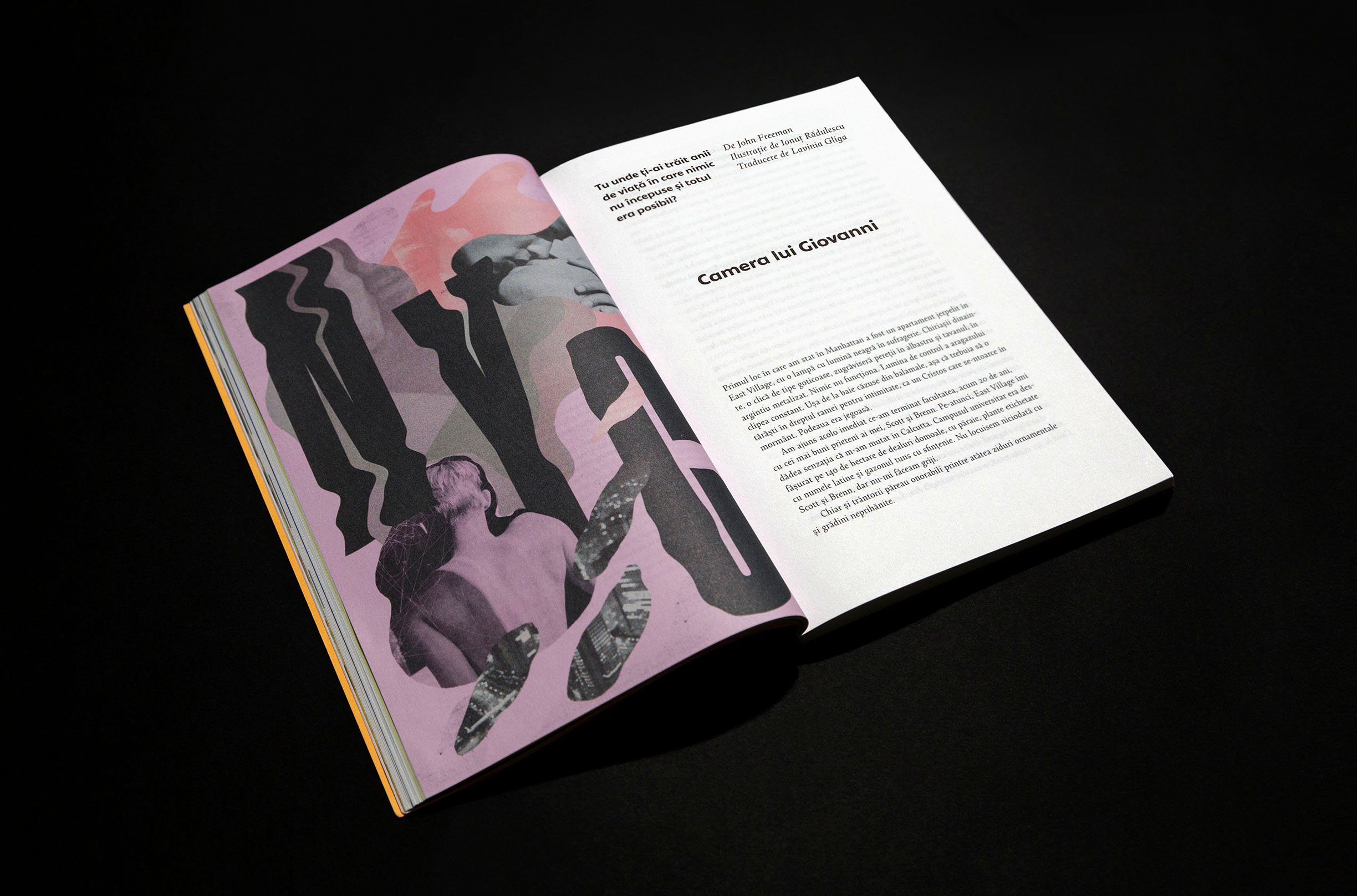
Giovanni’s RoomLettering & Illustration
RDW 20Lettering & Illustration
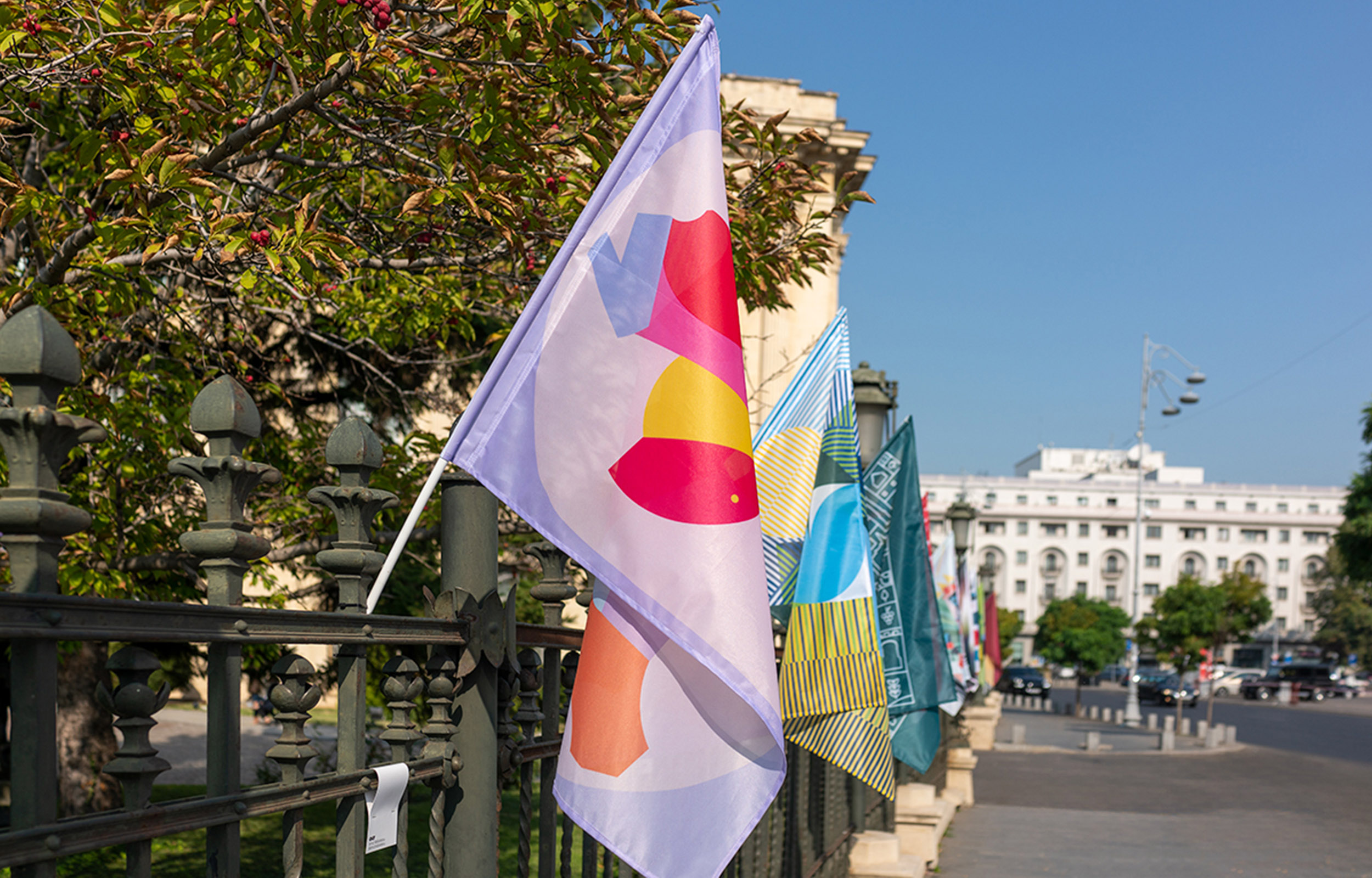
Print Club LondonIllustration
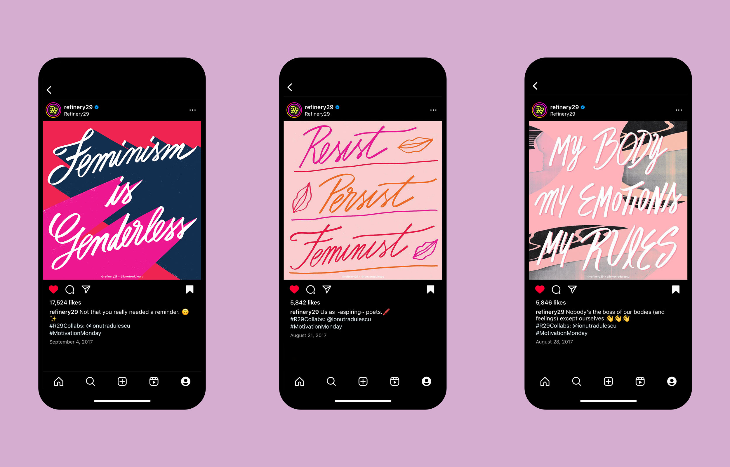
Refinery29 ArtworkLettering & Illustration
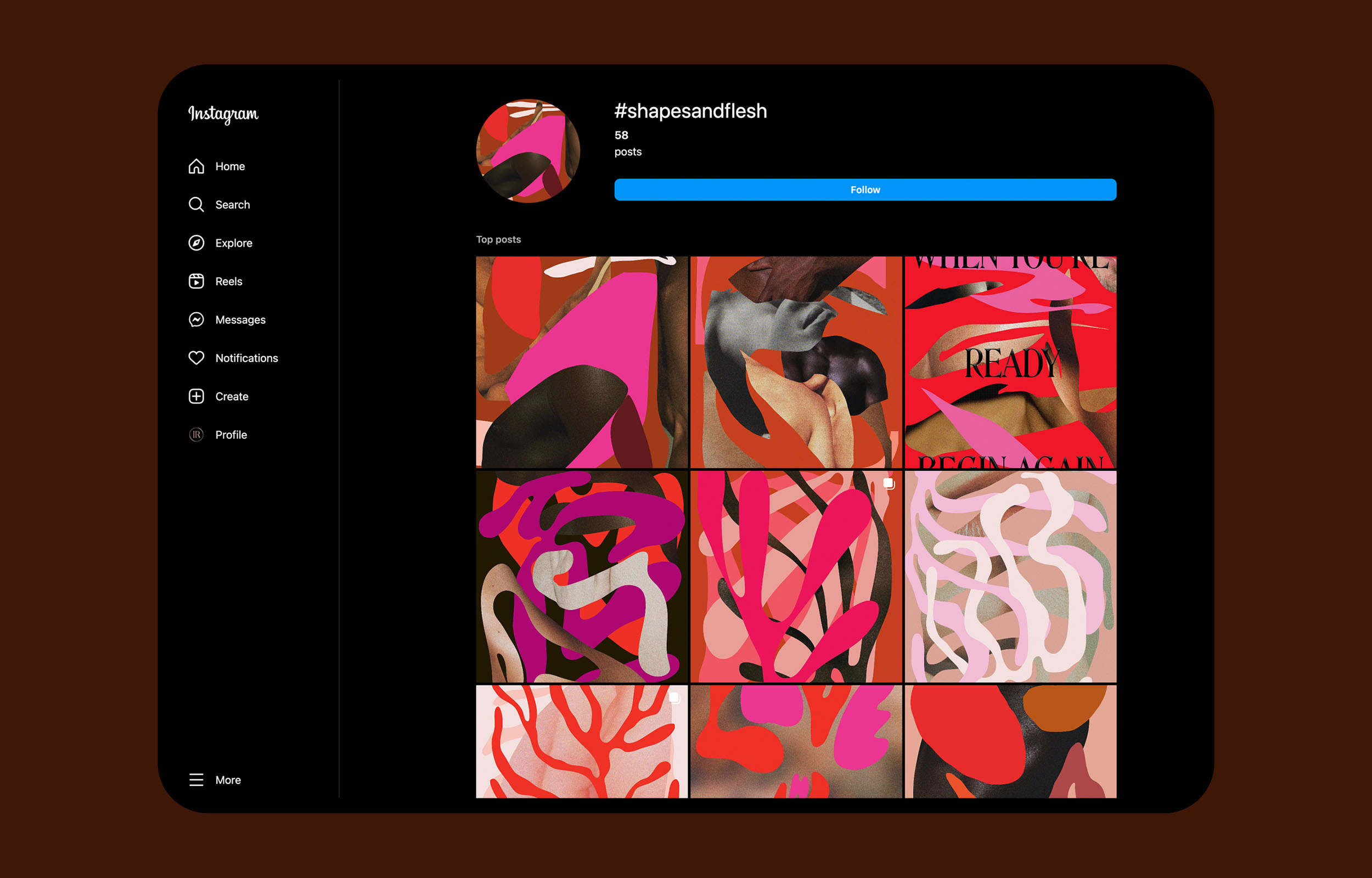
Shapes and FleshIllustration
Good VibesLettering & Illustration
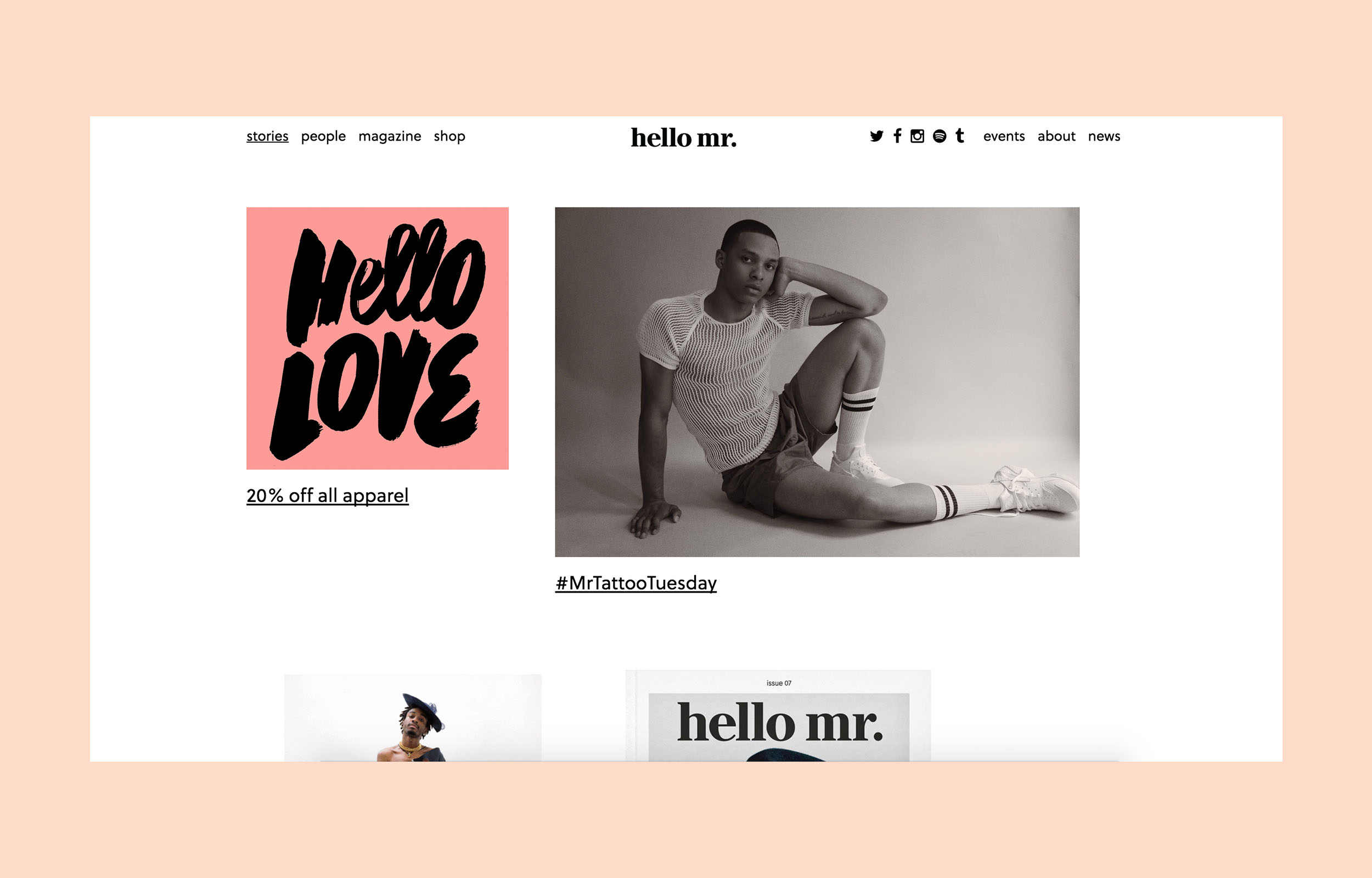
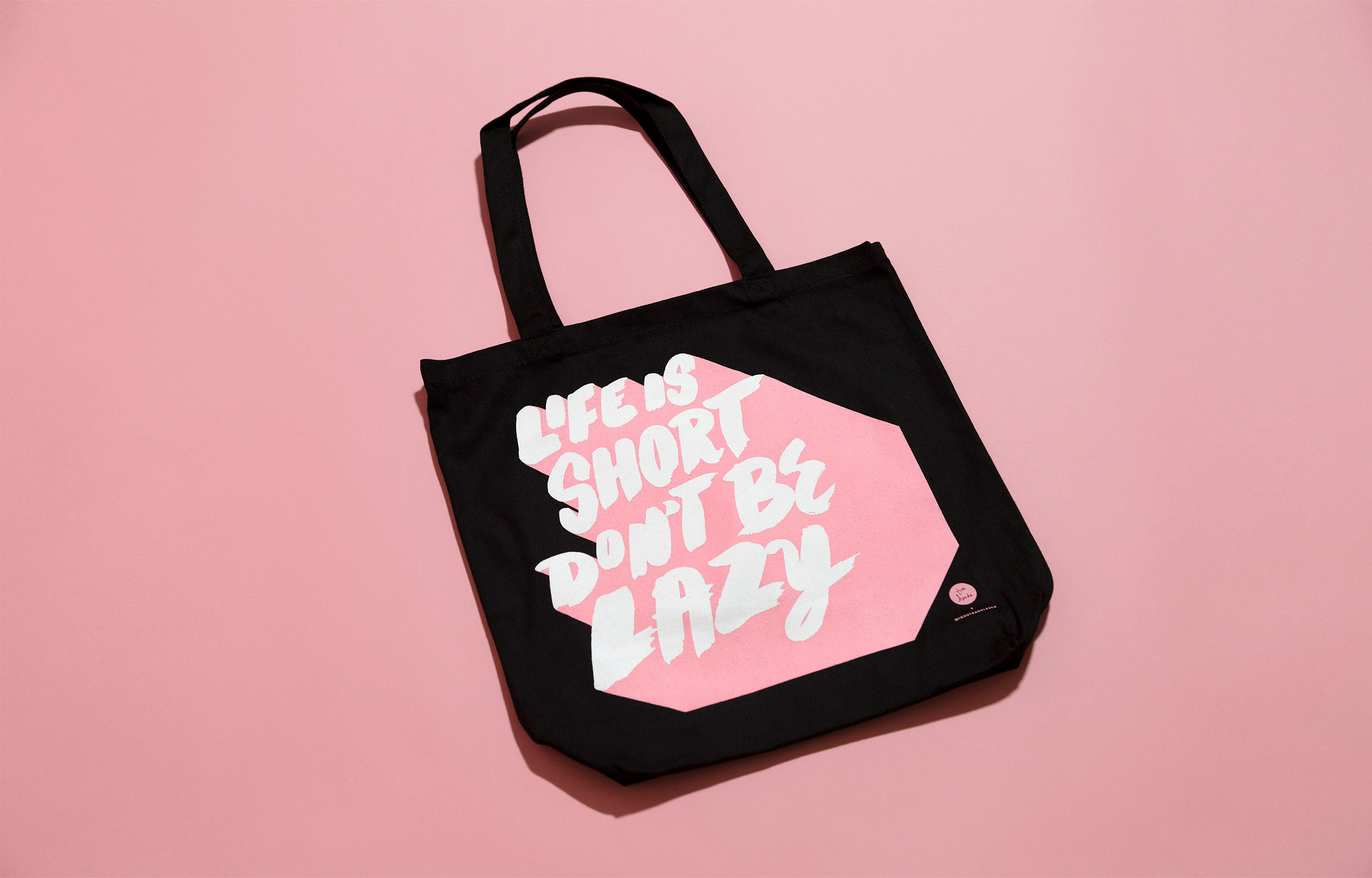
Hello Mr. MagazineLettering & Illustration
Misc. ArtworkLettering & Illustration
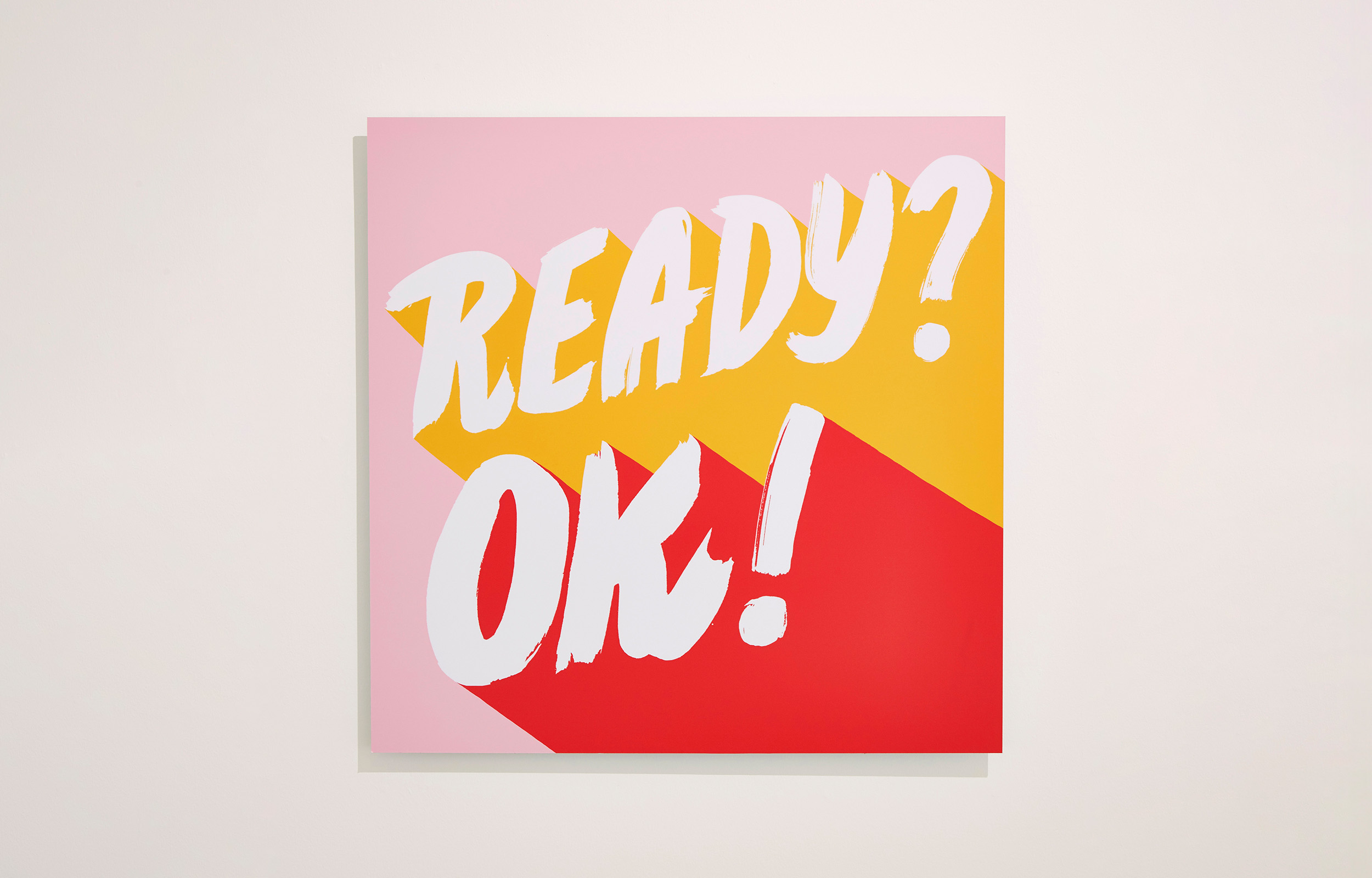
Ready?Ok!Lettering & Illustration
Design*SpongeLettering & Illustration
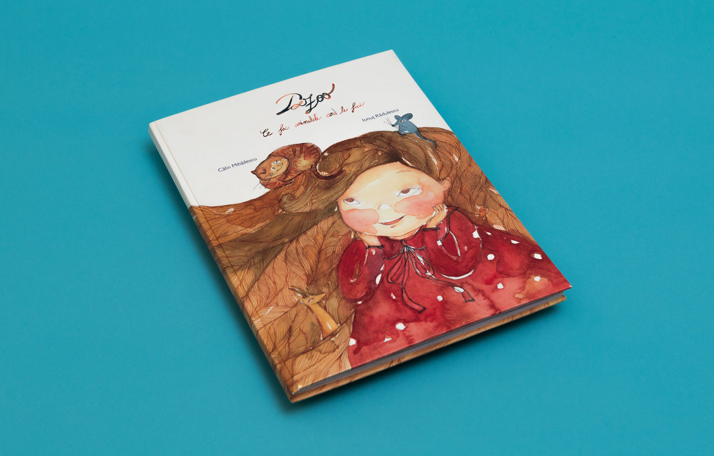
PoezooIllustration & Graphic Design
© 2025 Ionut Radulescu